Multidisciplinary graphic designer working across brand systems, campaigns and visual communication.
I have worked in-house, in an agency environment, and as a long-term freelance partner. My work spans award-winning projects as well as long-term brand and system development.

Highlights

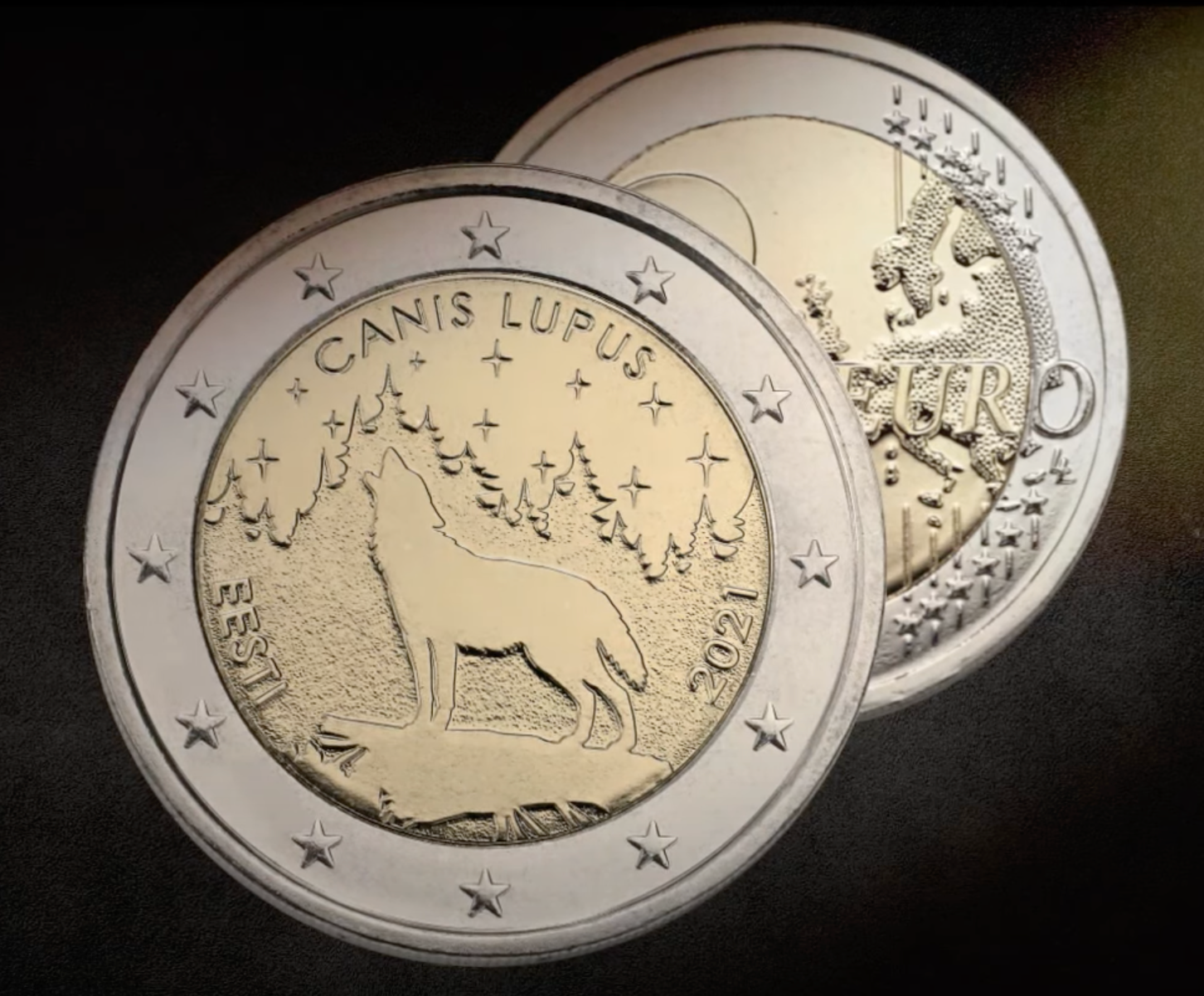
Commemorative coin — Bank of Estonia

Packaging system — Golden Egg, 1st place

Label series & illustrations — Golden Egg shortlist ×2
Work experience
Click any role to expand
Rohe Auto
Creative Partner
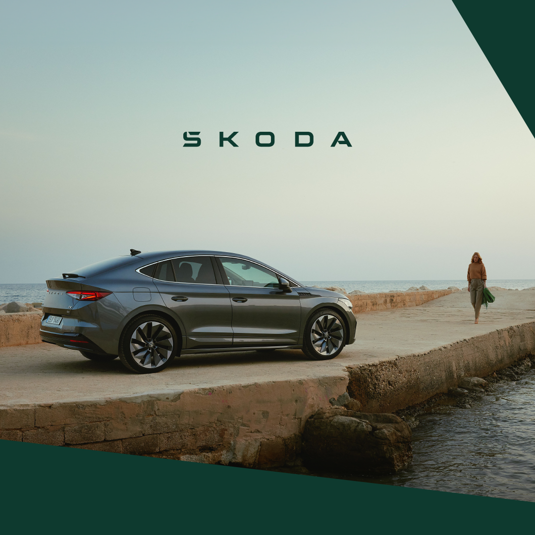
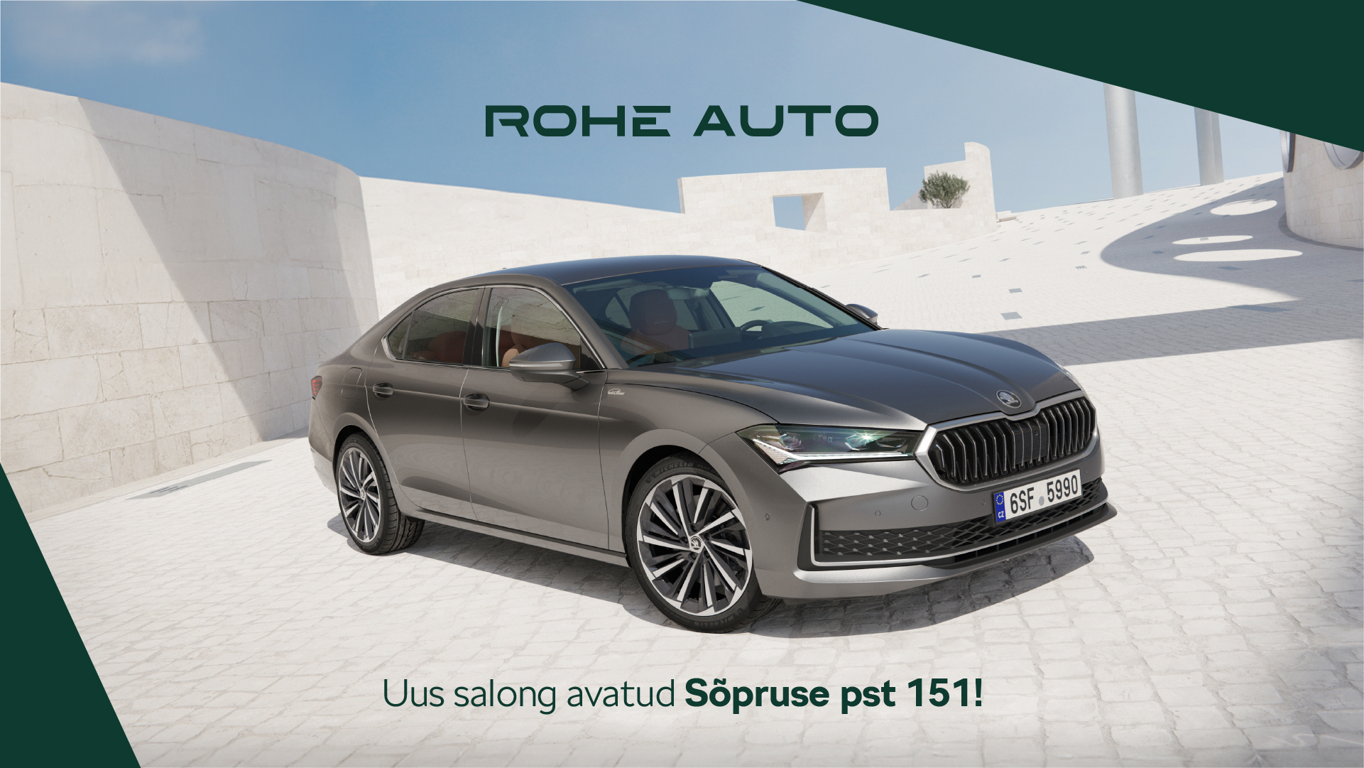
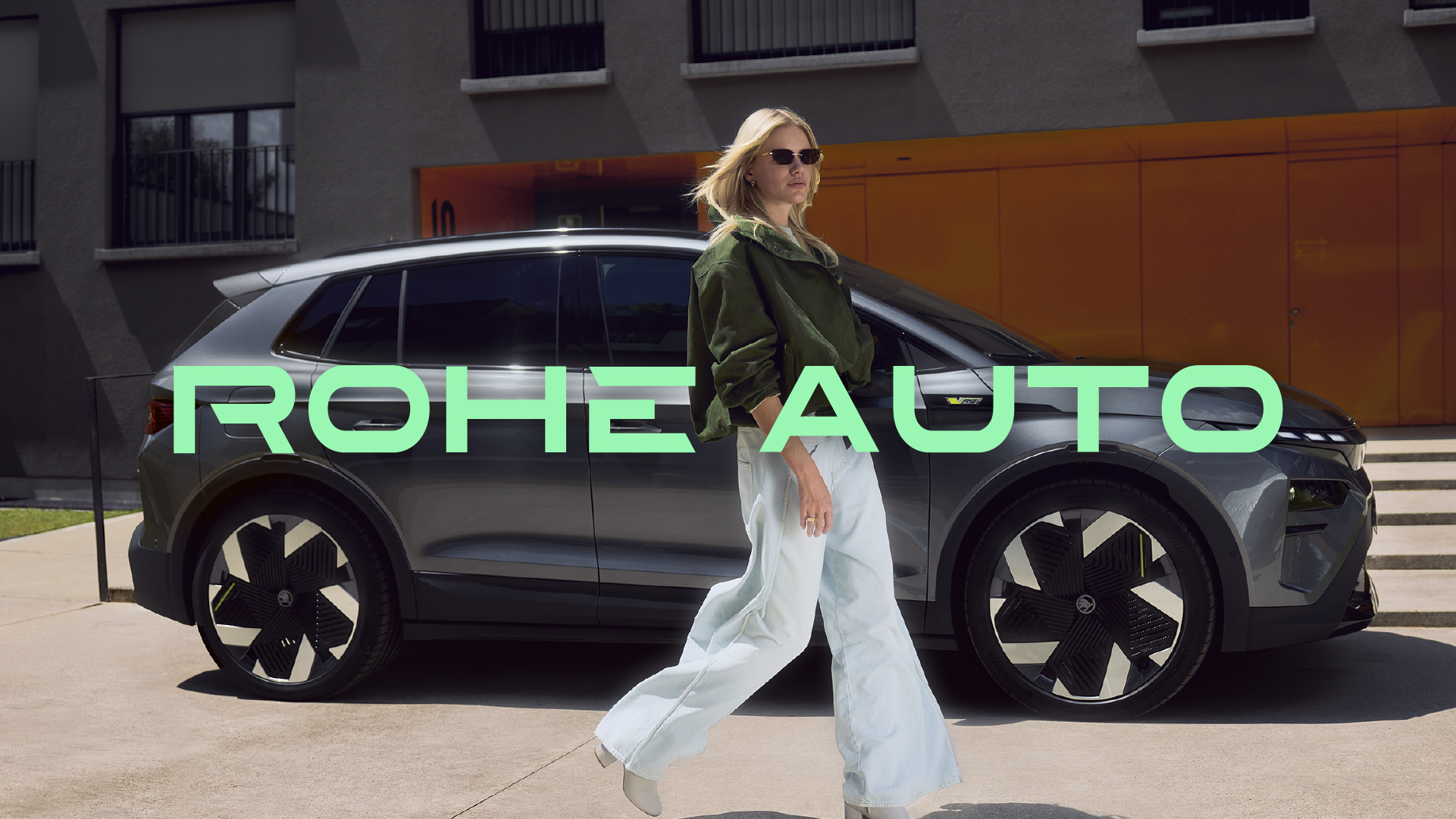
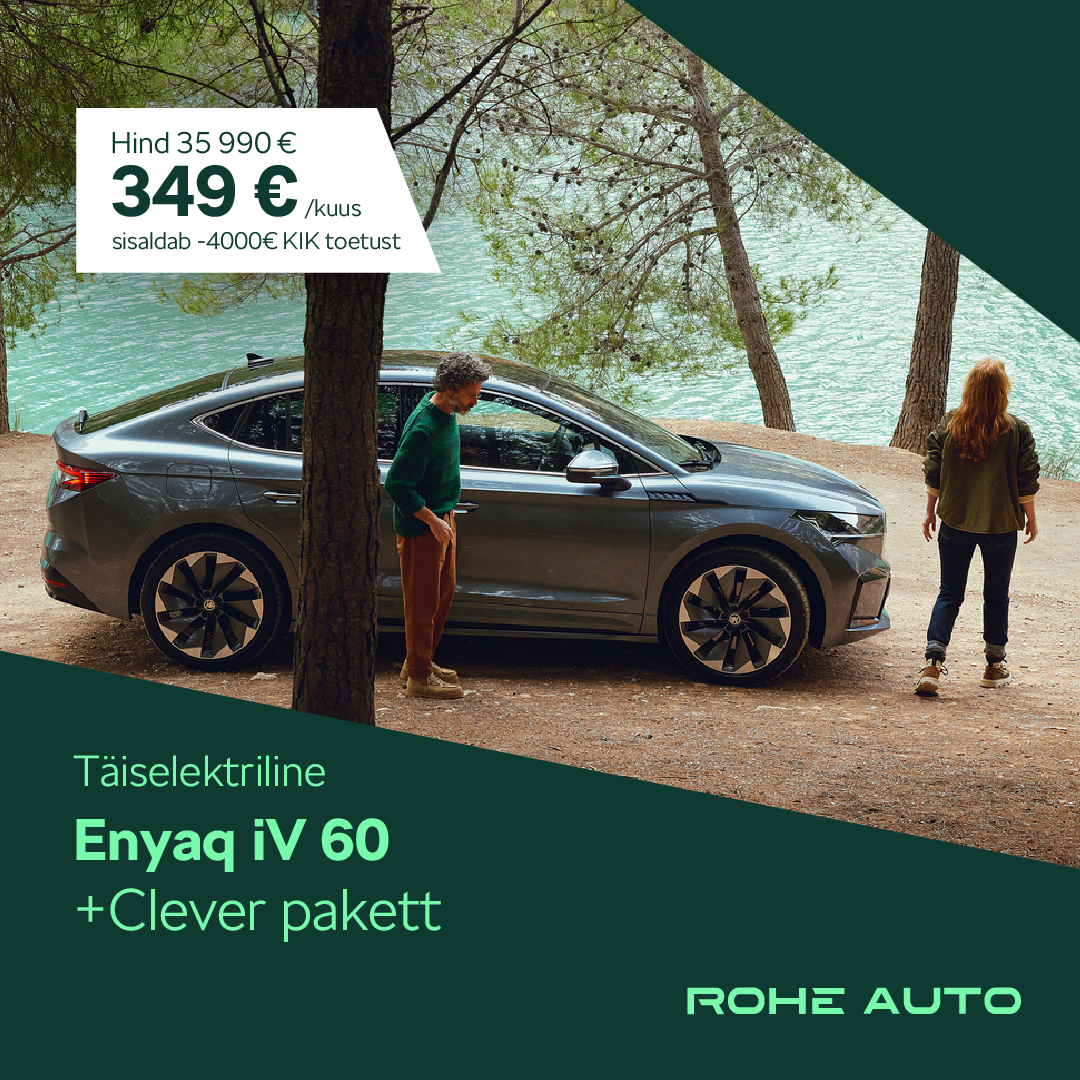
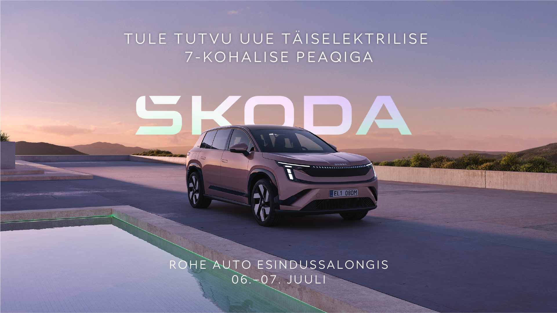
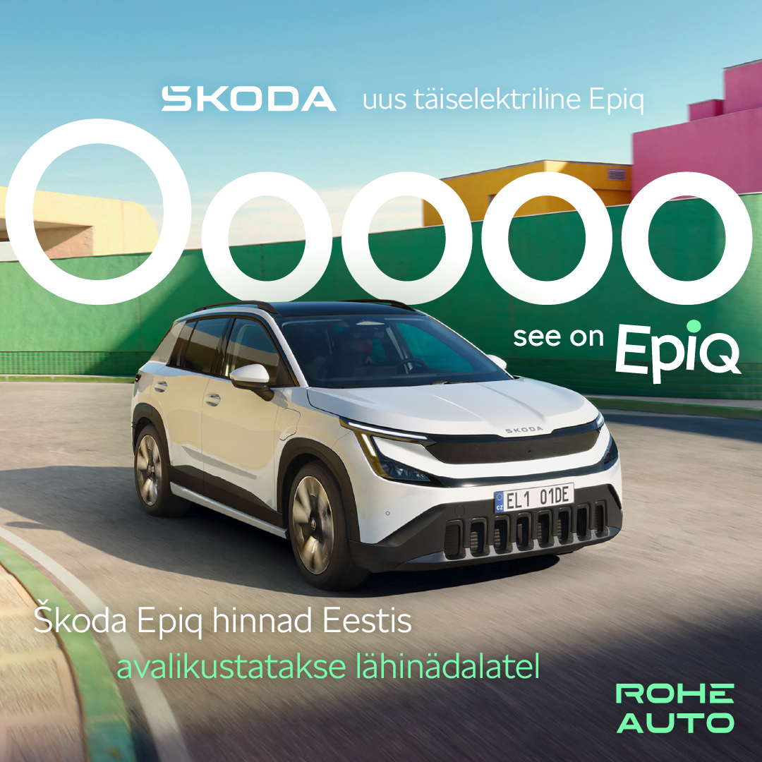
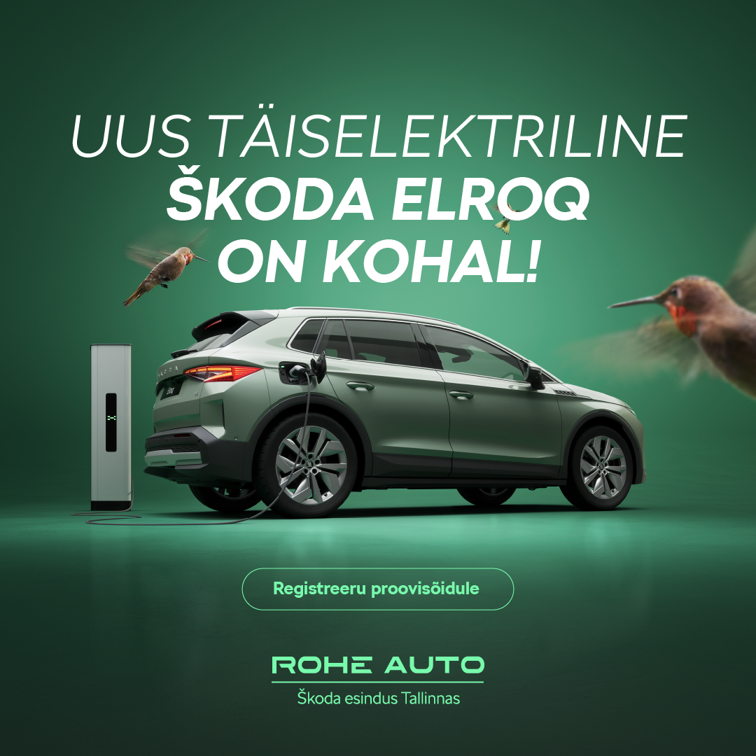
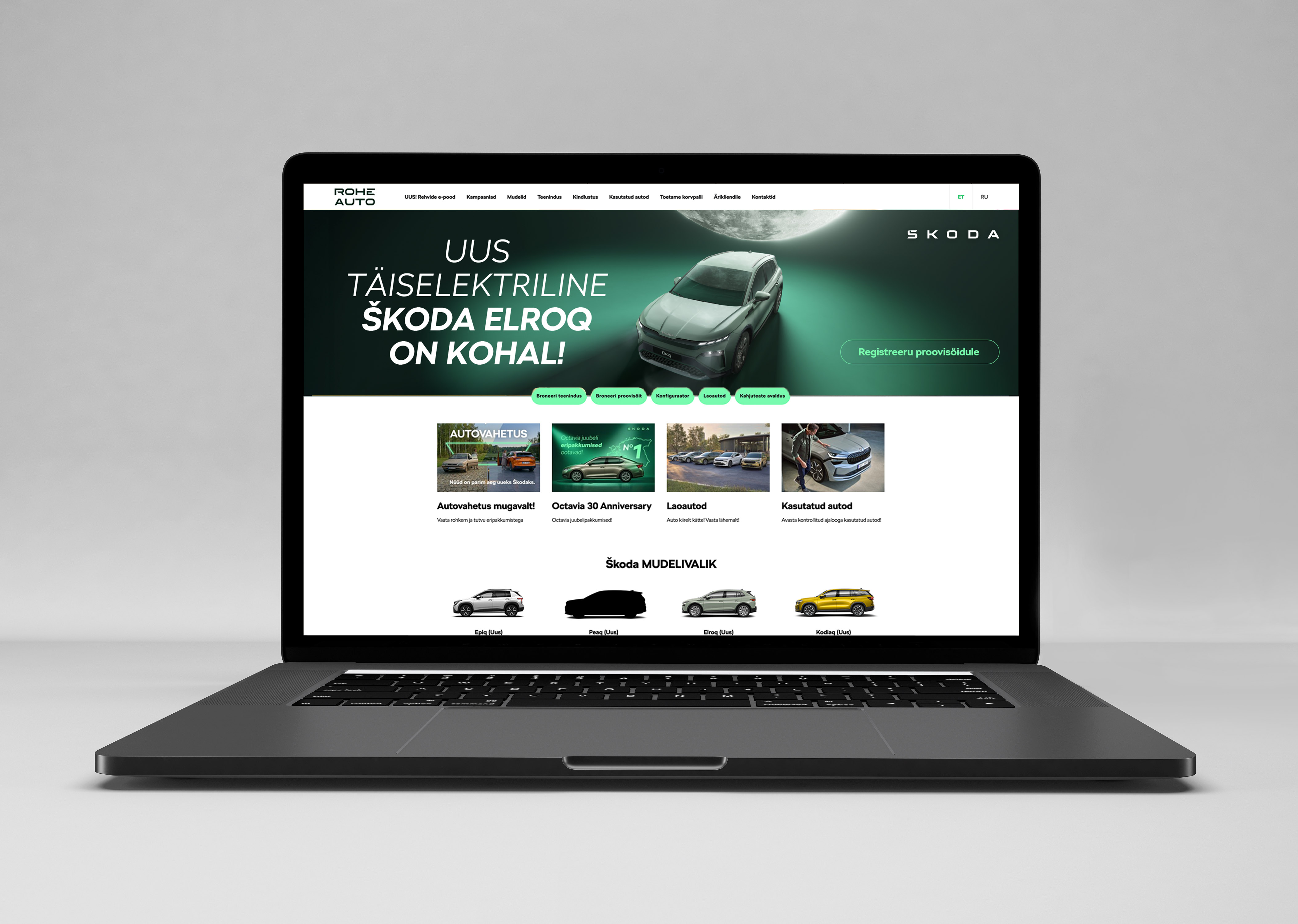
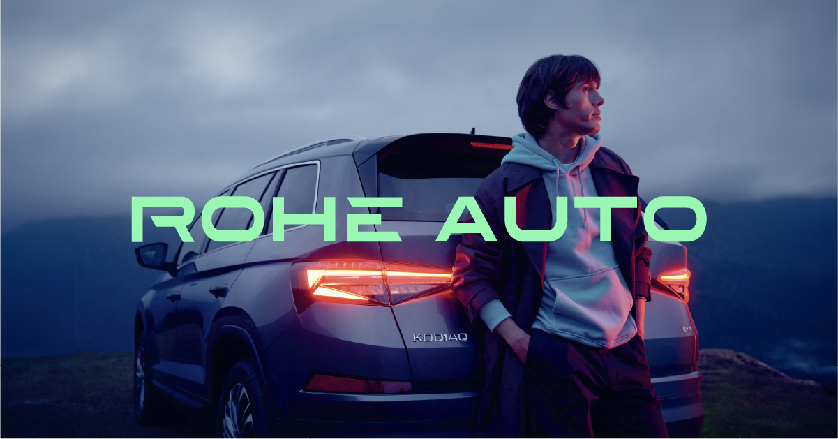
Visual positioning to market leadership: three years of exclusive creative direction and graphic design for one of the Baltic region's most prominent automotive brands.

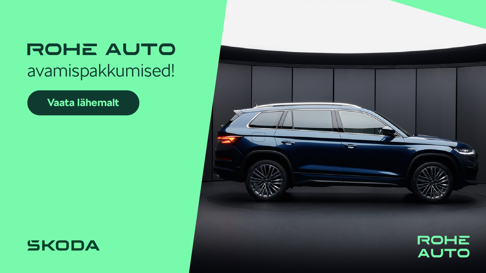
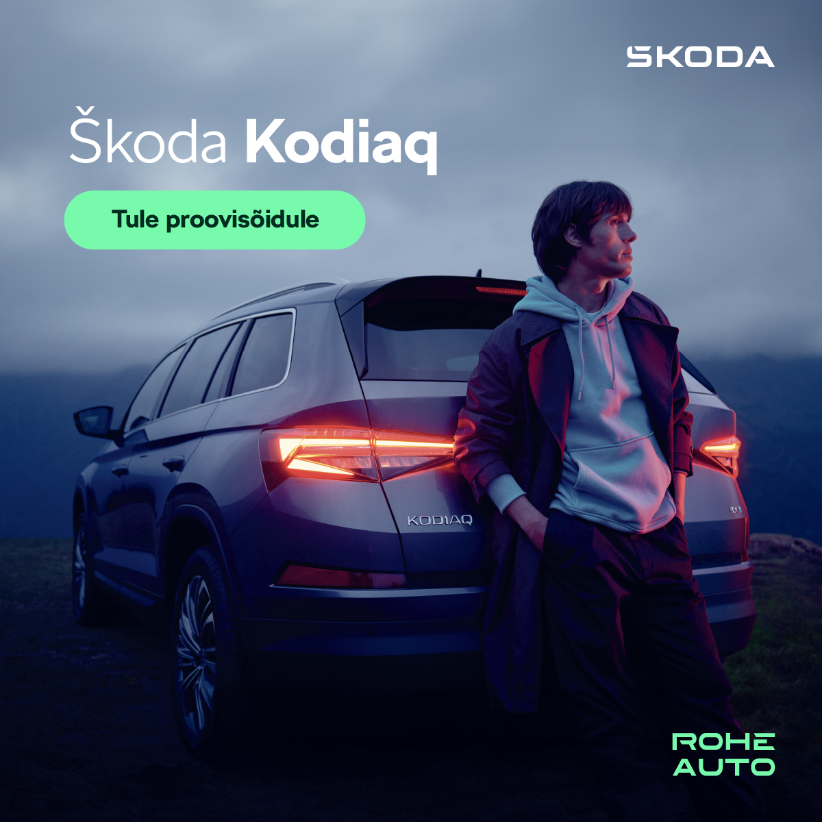
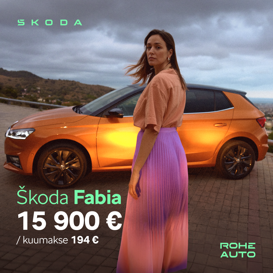
My role: Exclusive Graphic Designer & Visual Creative Partner. Alongside Rohe Auto's marketing lead, I lead the visual direction — from digital and print campaigns to branding, retail and ambient media, and corporate presentation assets.
Rohe Auto AS is Estonia's largest Škoda dealership and one of the most prominent automotive retailers in the Baltic region. Over the past three years, I've shaped its visual identity across every customer touchpoint — translating Škoda's rigorous global brandbook into a locally relevant, emotionally engaging design language.

Over the past three years, Rohe Auto has undergone a massive commercial and visual growth spurt, establishing itself as the undisputed ruler of the capital's automotive market — with revenue surging by +81% to nearly €67 million.
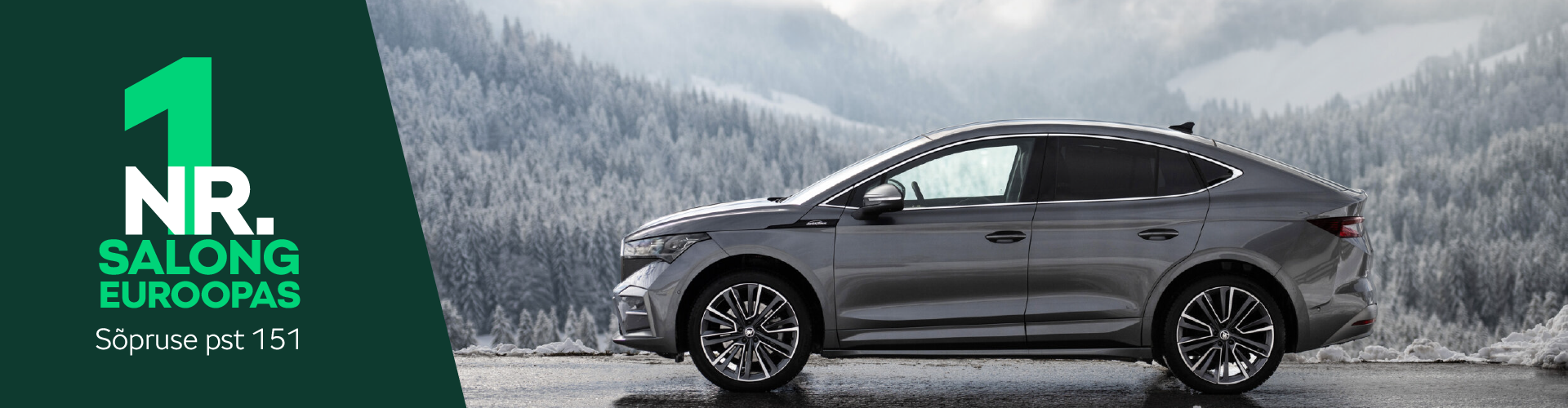
The crown jewel of this period was the highest possible recognition from the manufacturer: the Škoda Best Dealer in Europe award. The title explicitly evaluates the design of the customer journey and the flawless execution of brand standards — the very visual foundation and daily marketing language I developed.
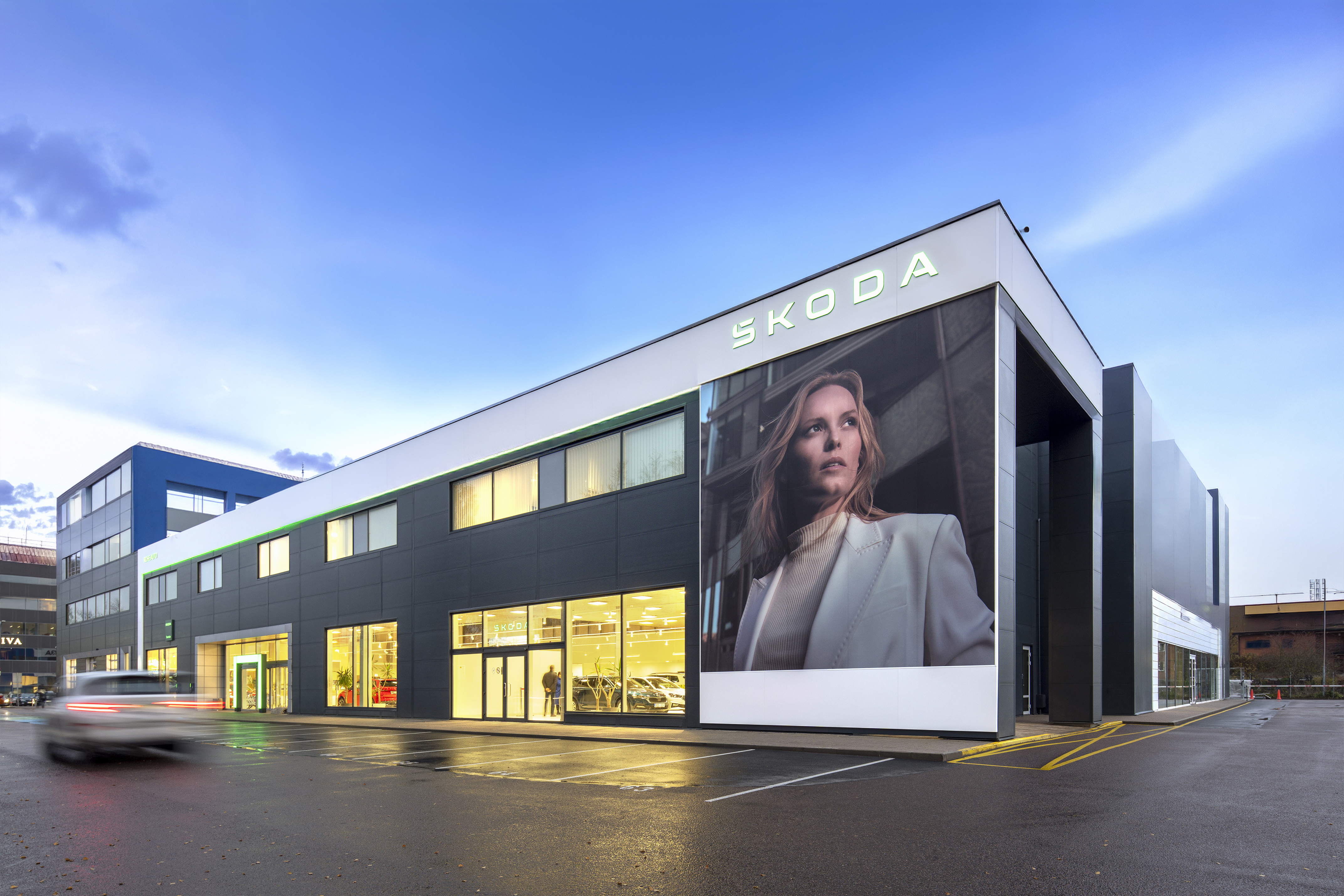
My partnership with Rohe Auto began shortly after the dealership had relocated to its state-of-the-art facility on Sõpruse puiestee. Building sustained address awareness was still a long-term priority, so I wove the new location into the visual DNA of every digital ad, social campaign, and print asset over the following year — re-anchoring the brand and driving consistent foot traffic to the new showroom.

When I joined in 2023, Škoda had just completed a major global rebrand — a shift away from traditional, product-heavy automotive ads toward a modern, human-centered picture language and a lifestyle-oriented aesthetic. My role has been to translate this new design philosophy into the Estonian market, adapting rigid international guidelines into local digital, print, and retail assets. The result: a warmer, more relatable brand experience that feels authentically Rohe Auto while staying true to Škoda's global identity.

A cornerstone of my work is executing campaigns for Škoda's product evolution — both model upgrades and entirely new vehicle debuts. Each completely new model launch arrives with its own distinct, standalone branding campaign that often deviates significantly from the corporate brandbook. This requires rapid creative flexibility: I adopt each unique visual identity and translate it into cohesive digital, print, and showroom assets, ensuring every new vehicle stands out with its own disruptive visual narrative.

Rohe Auto has been a major supporter of Estonian basketball since 2018 — an enduring sponsorship that opened up a high-visibility avenue for sports marketing. I designed a vast array of game-day assets, from event signage and print materials to courtside LED animations. Adapting the brand's visual identity to a fast-paced, high-energy environment required a strong focus on motion design and impact, amplifying Rohe Auto's community presence and strengthening its emotional connection with thousands of live and broadcast fans.
Three years into my work with Rohe Auto AS, the partnership stands as a testament to how strategic, consistent graphic design can support a business's growth — from local capital-city leader to internationally certified, top-tier European dealership. From building long-term address awareness for the new showroom to translating Škoda's global rebrand into the Estonian market, this tenure has deeply refined my ability to manage complex brand ecosystems — navigating the line between rigid international guidelines and the fast-paced rhythm of local market dynamics.
Tallink Grupp
Graphic & Web Designer
Working in-house at Tallink Grupp's Marketing and Branding department since 2023, across branding, motion, packaging, on-board print, and spatial design. The output ranges from a single door sign to the painted side of a ship — produced across the fleet, terminals, and customer-facing campaigns. The projects below are a selection; the rest fills three years of internal work, tactical campaigns, and recurring updates.

Ship Exterior
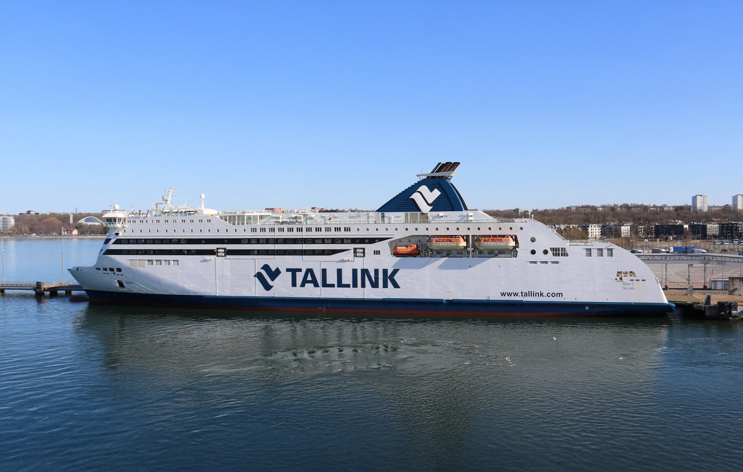
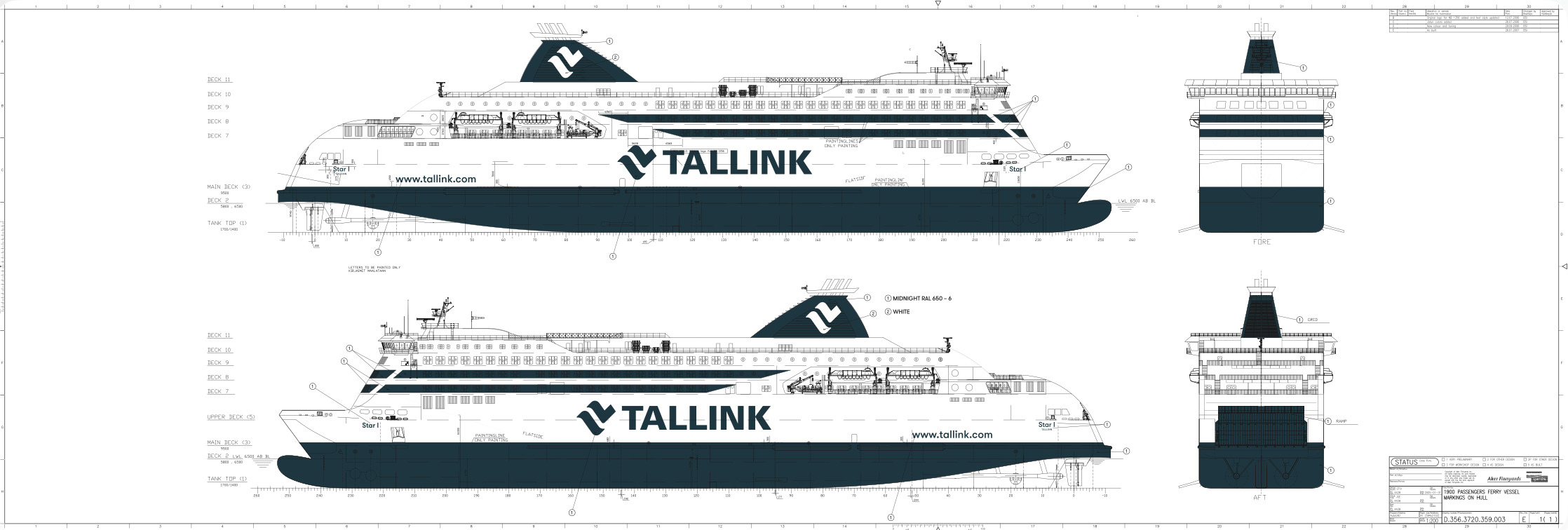
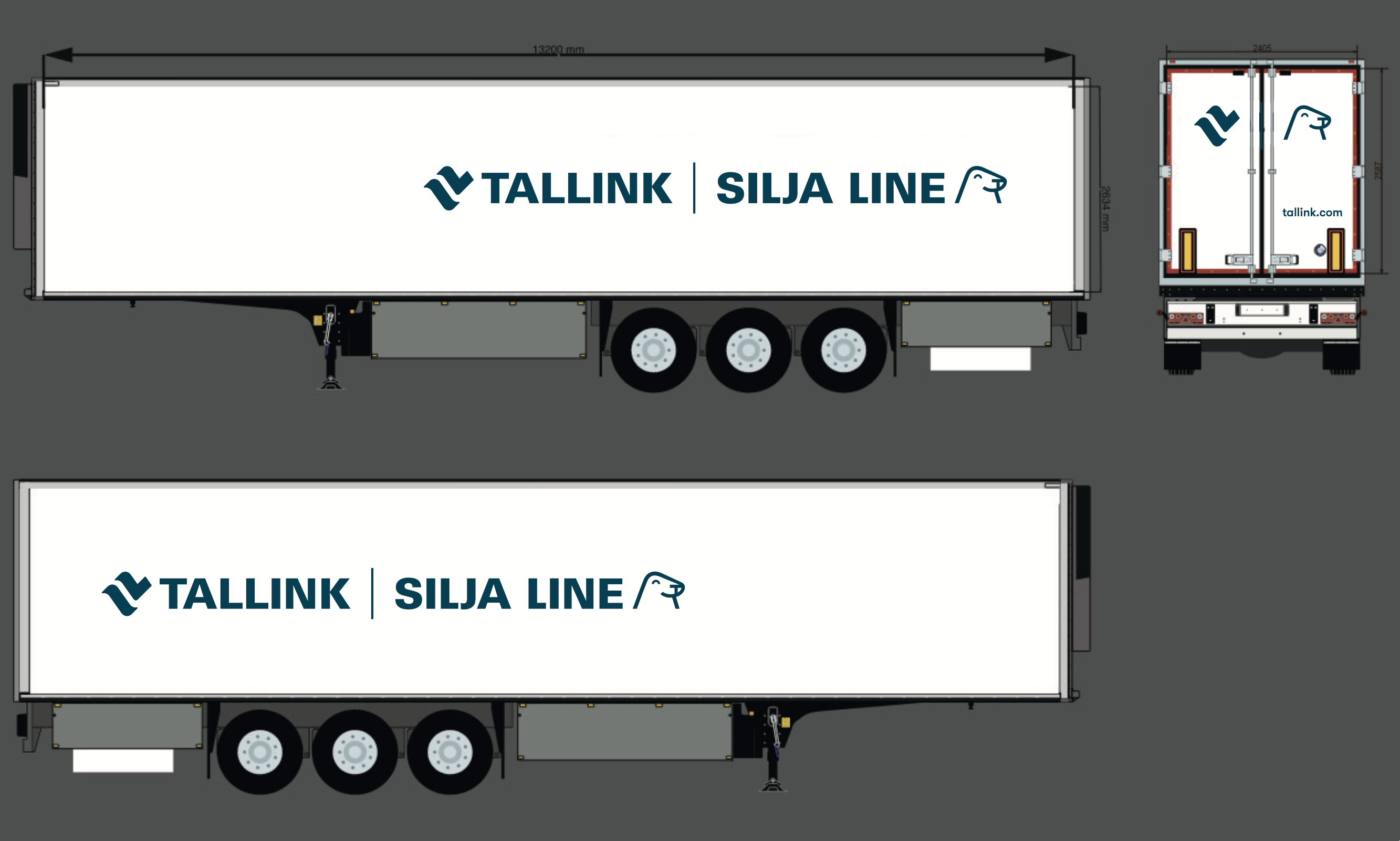
Technical drawings and production files for ship-exterior design. The brief: translate the chosen concept into precise specifications, then prepare the materials used by the paint team to apply the design to the hull of a passenger vessel.

Concept design: Linnar Kaljuvee. Technical drawings & implementation: Maria Meos.

Branding
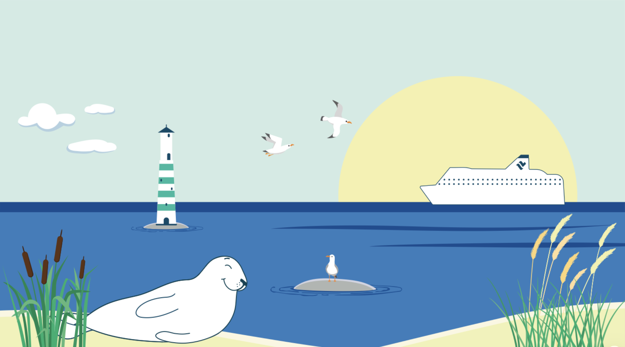
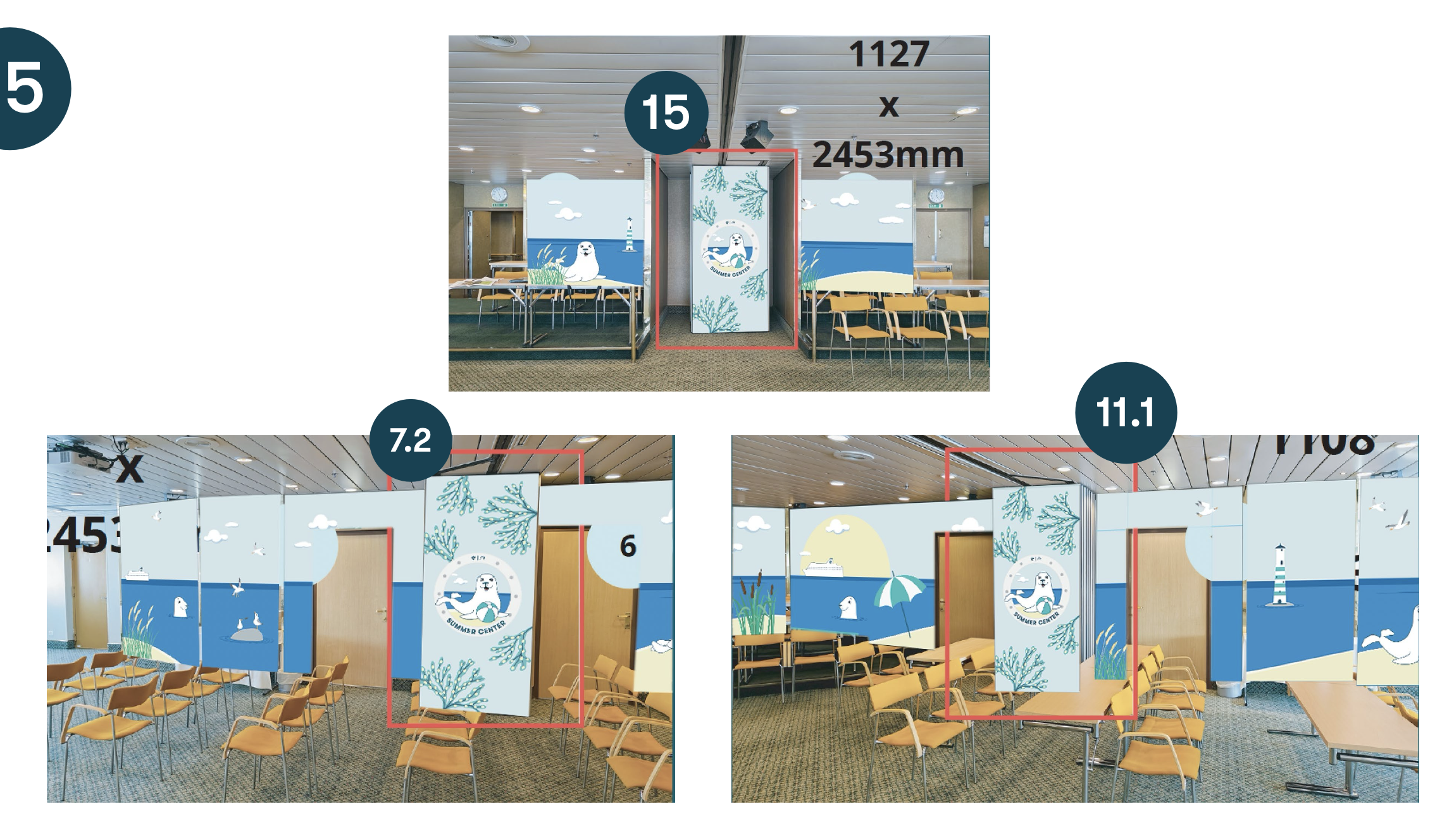
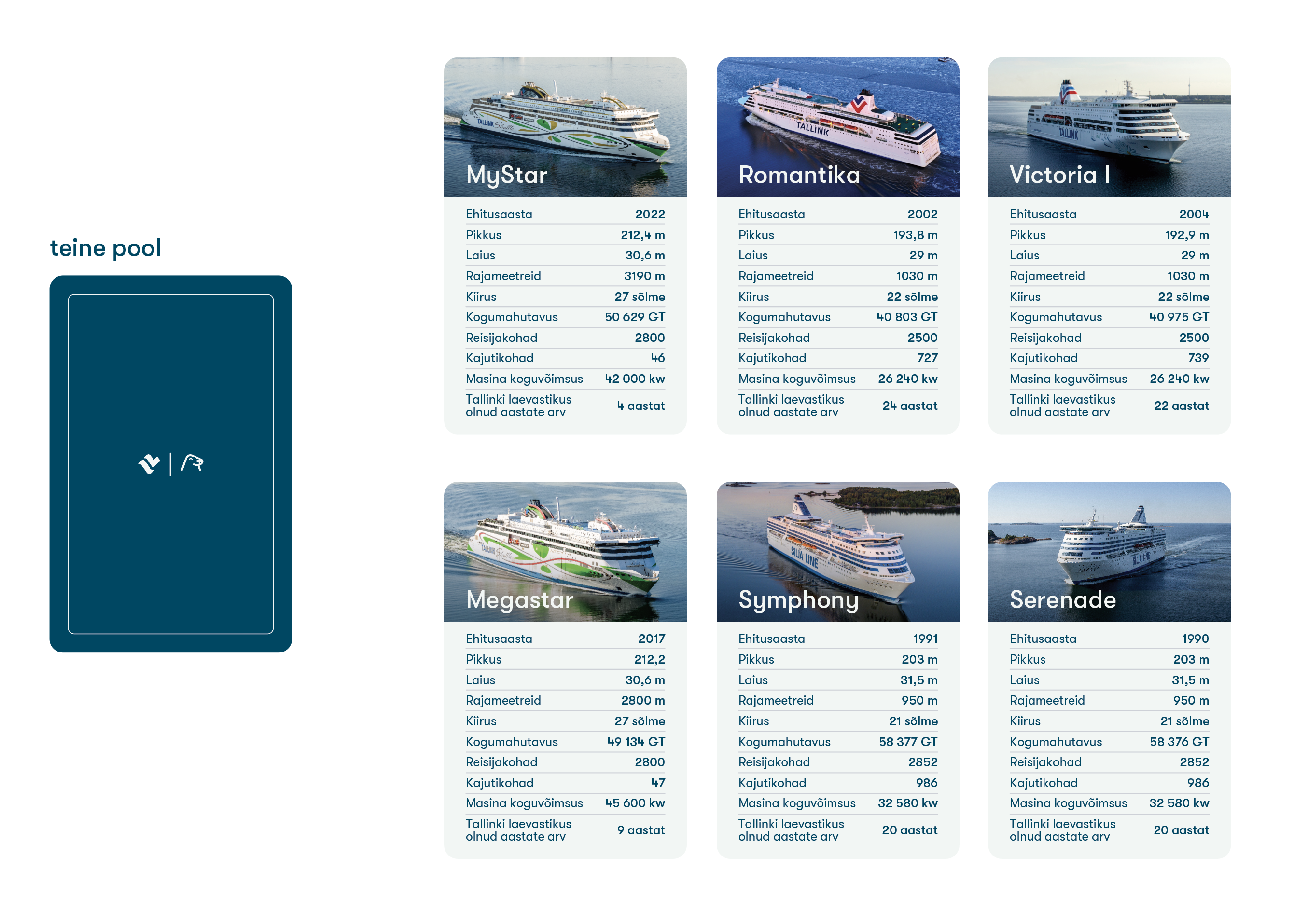
A refresh of Tallink's mascot Harri the Seal brand — new illustrations, character poses, and a tightened CVI. Beyond the brand book, the work continued into the spaces children actually meet Harri: the Romantika ship's playroom and the seasonal summer kids' club, where the new identity covers walls, signage, and print across both rooms.


MS Romantika and MS Victoria I children's areas planning and mockups
Packaging
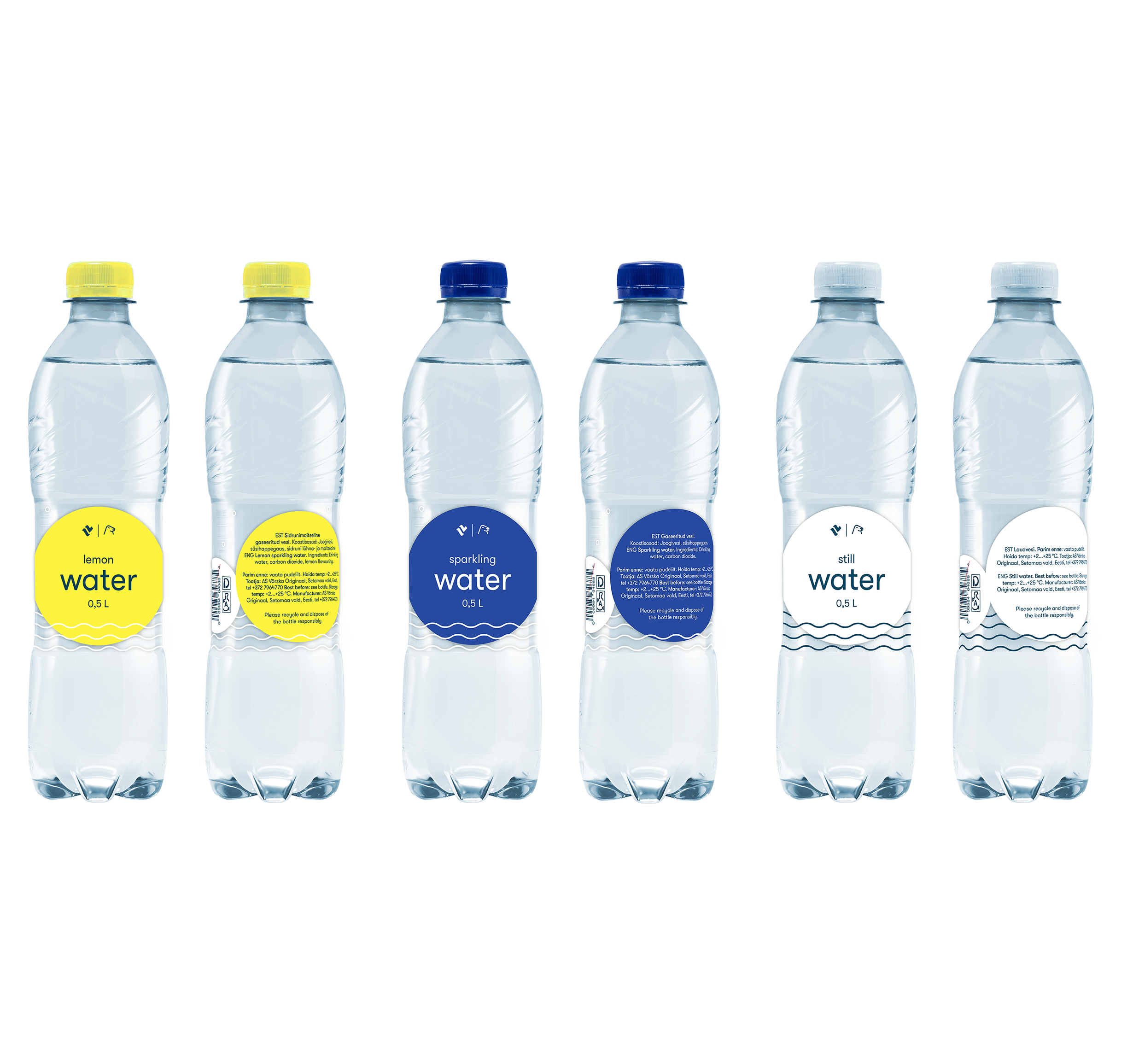
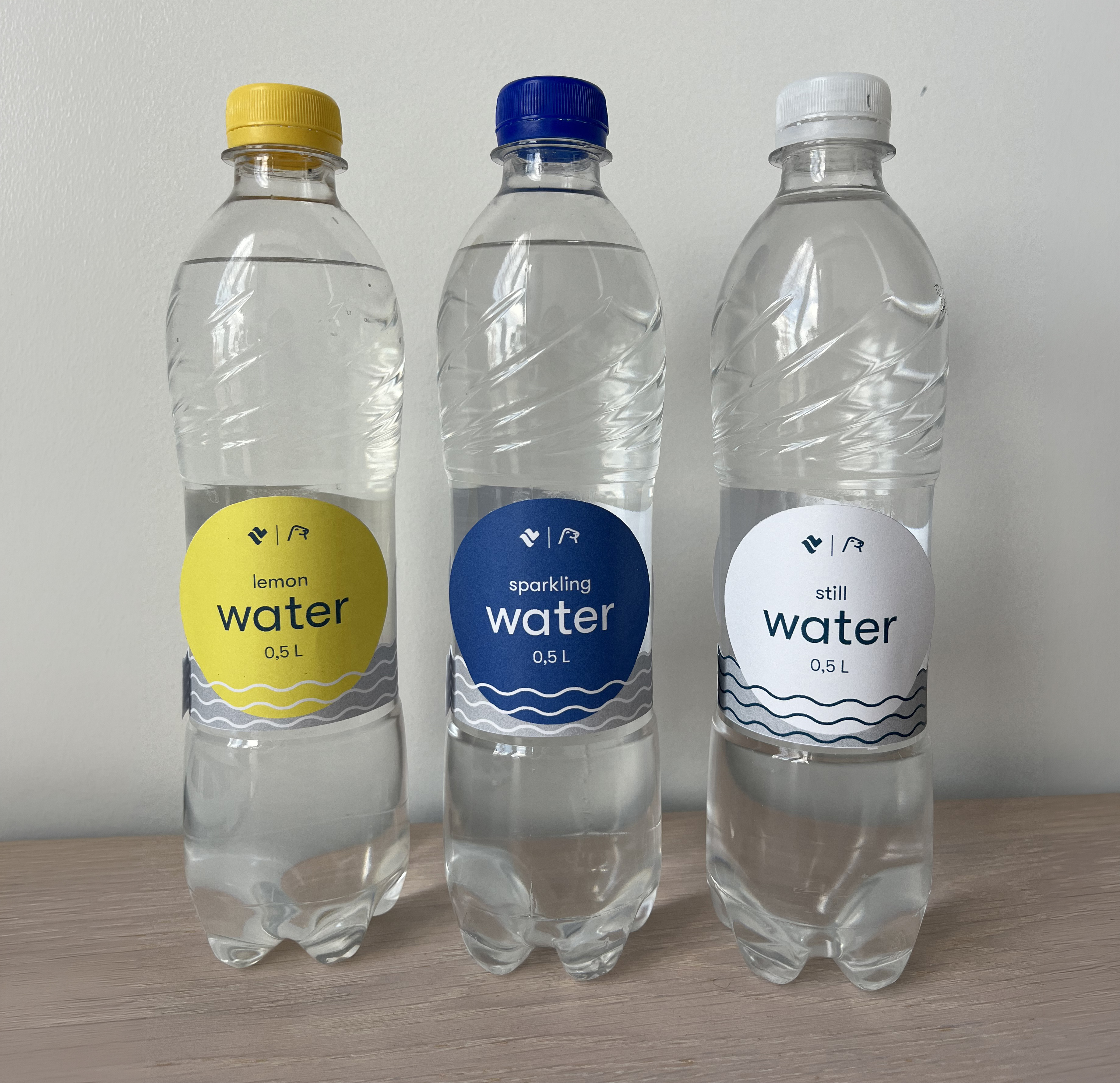
New label design for Tallink's bottled water — the bestselling on-board product across all vessels. A small project measured in surface area, but one that ships in millions of units a year.


Motion
Motion graphics and video editing across marketing campaigns — artist features, on-board talent series, and tactical promotions. The clips below are part of a larger output of weekly social, screen, and on-board video work.
Print & Materials
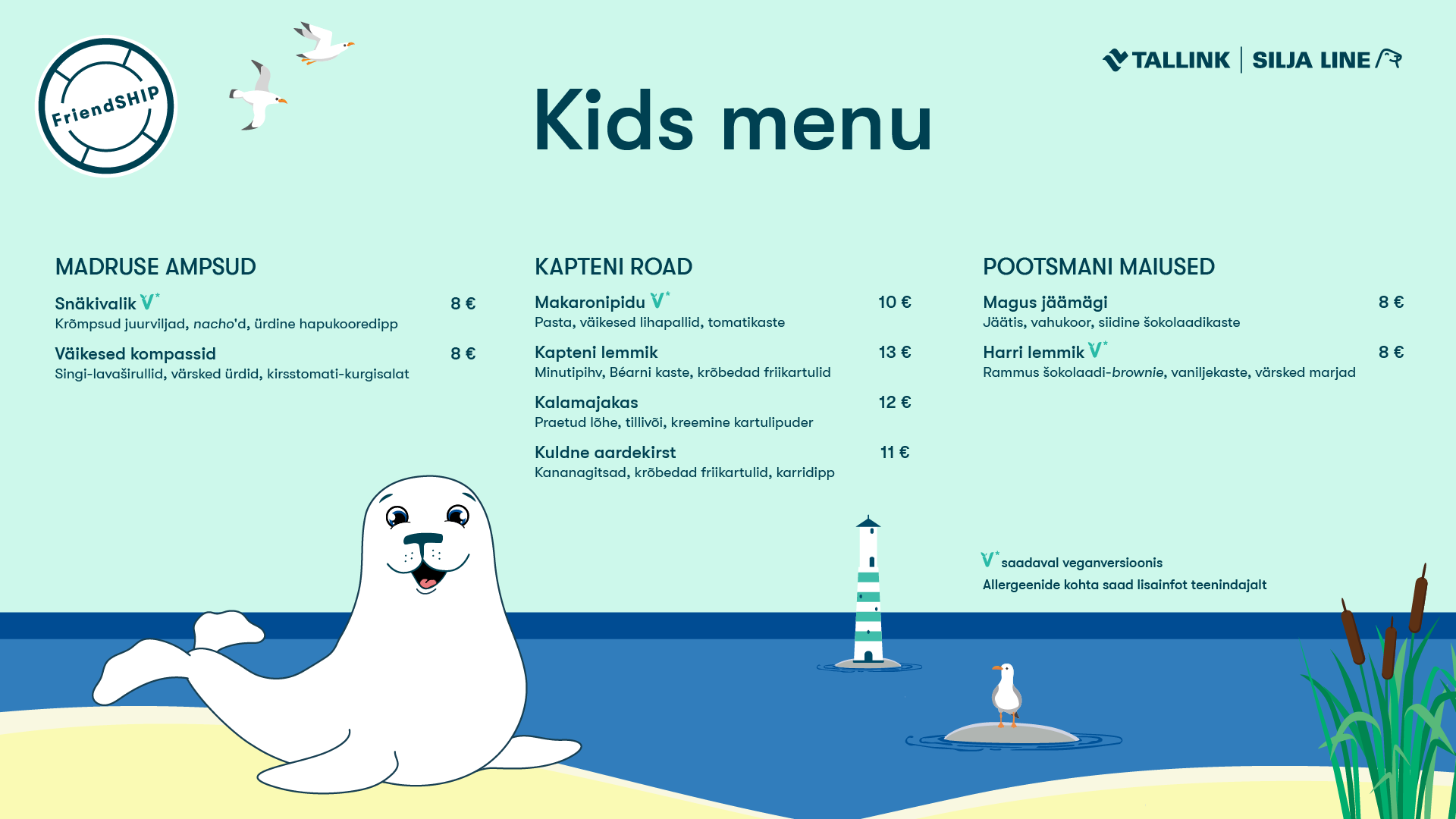
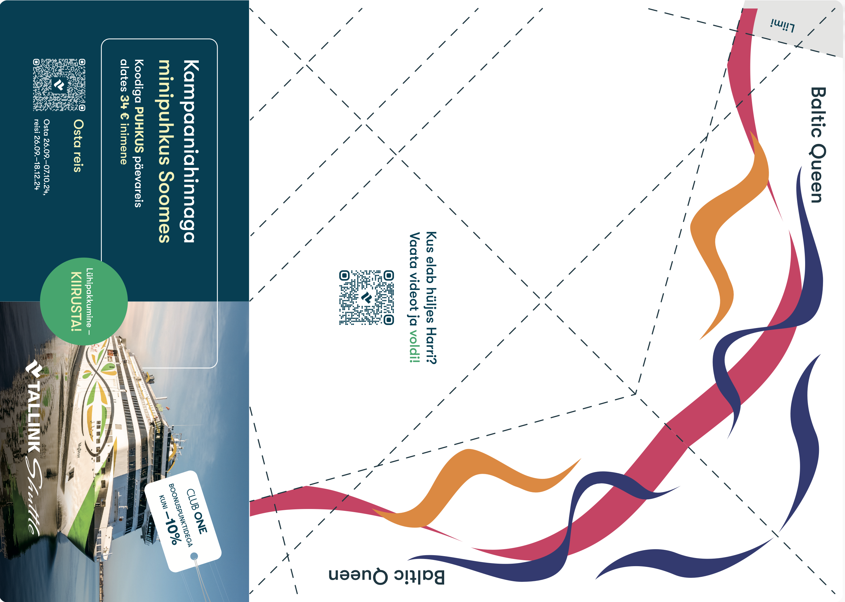
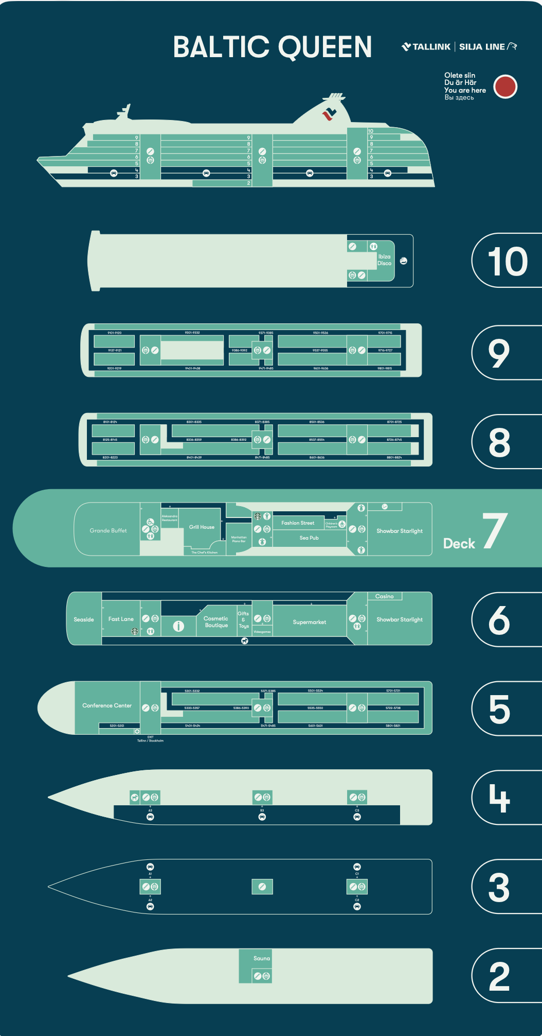
The day-to-day output: kids' menus, infographics, ship schematics, merch, direct mail, and a steady flow of campaign collateral. The pieces below are a representative cross-section.
.png)


Working in-house at Tallink has taught me to operate at scale — designing systems that hold up across a fleet, hundreds of touchpoints, and a rolling calendar of campaigns. From a single door sign to the painted side of a ship, the range is what makes the role interesting. What I carry forward is comfort with that scale, and a steady working rhythm with the marketing team I sit alongside every day.
Postimees Grupp
Graphic Designer
In-house graphic designer at Postimees Grupp — one of Estonia's leading media houses, operating across daily newspapers (with roots dating back to 1857), TV channels, radio, and digital platforms. The role spanned branding, multi-format campaign rollout, data visualisation, event collateral, HR materials, merch, and the steady visual output of a high-volume newsroom.

Branding
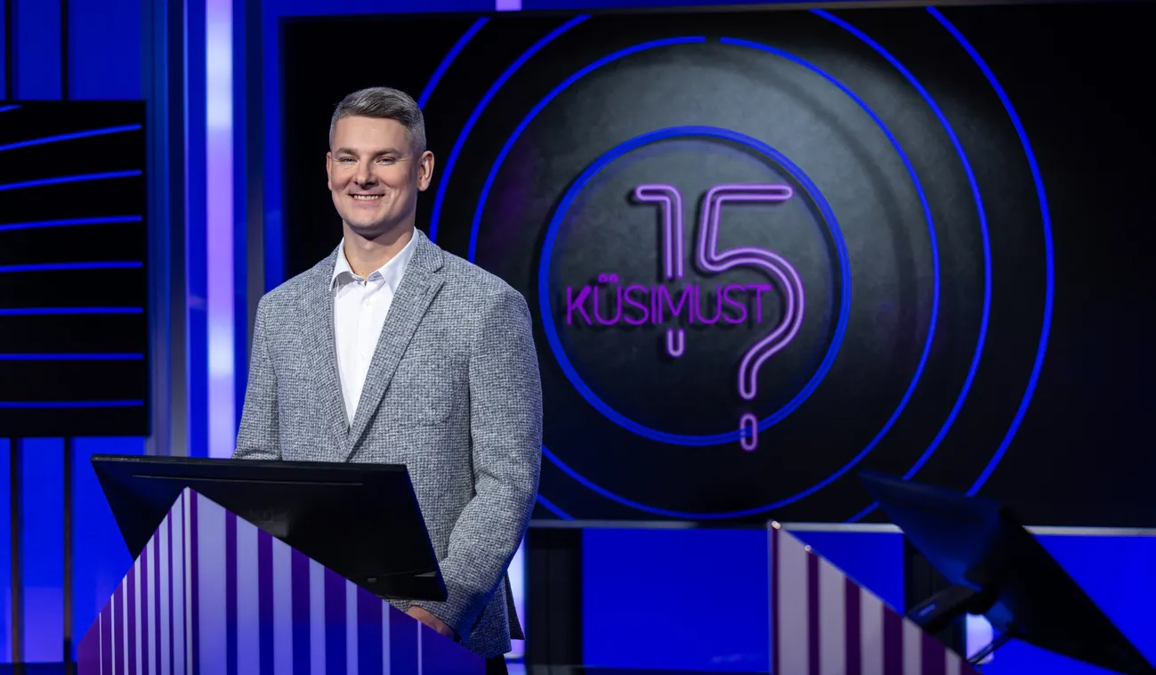
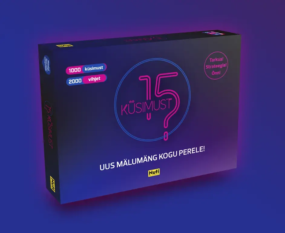
Logo and visual identity work for 15 küsimust, the long-running quiz show on Kanal 2. The brand needed to feel approachable and current while staying recognizable across episode graphics, on-screen lower thirds, and promotional materials.


Christmas Campaign
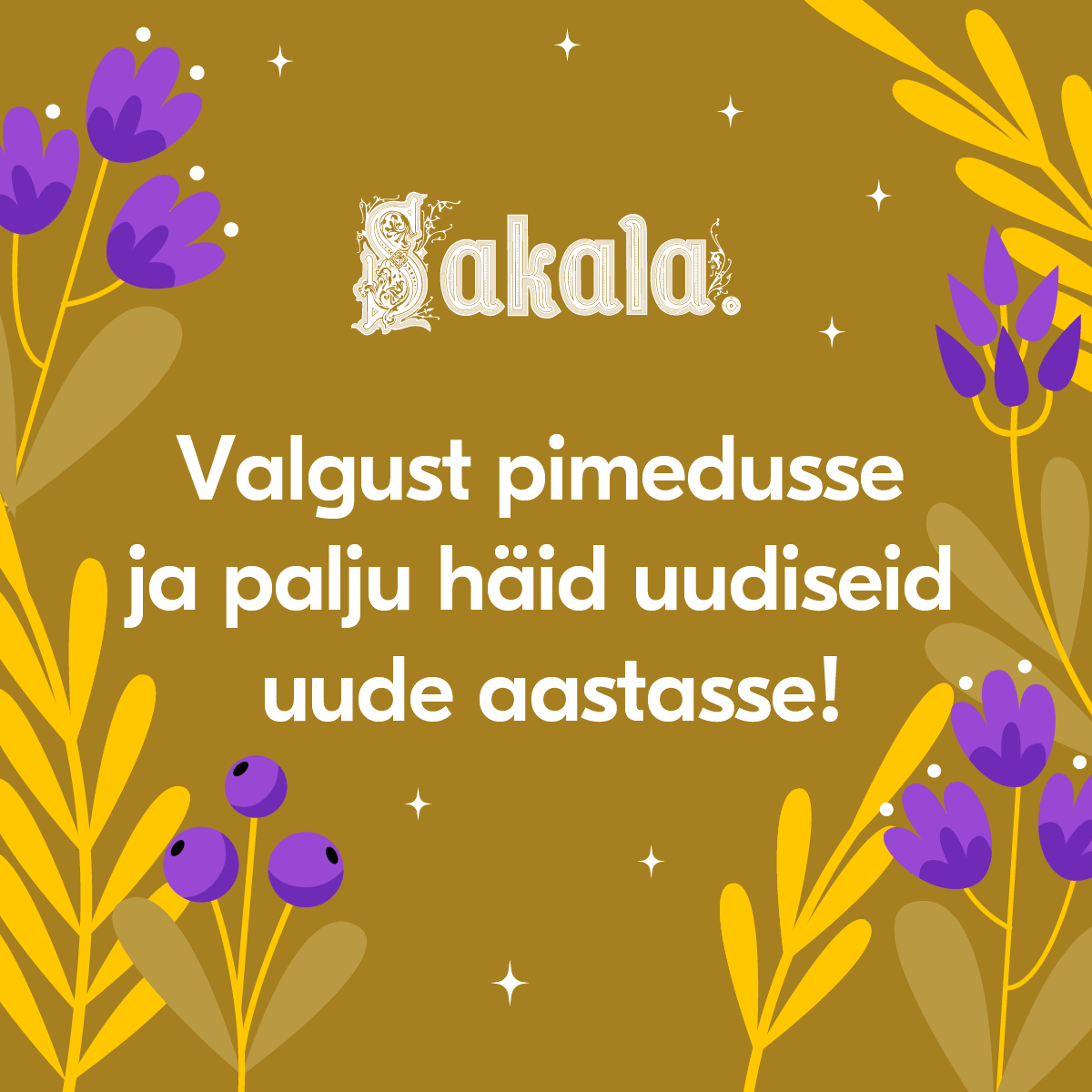
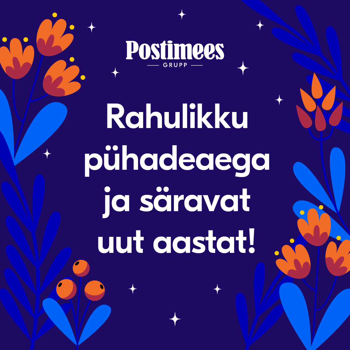
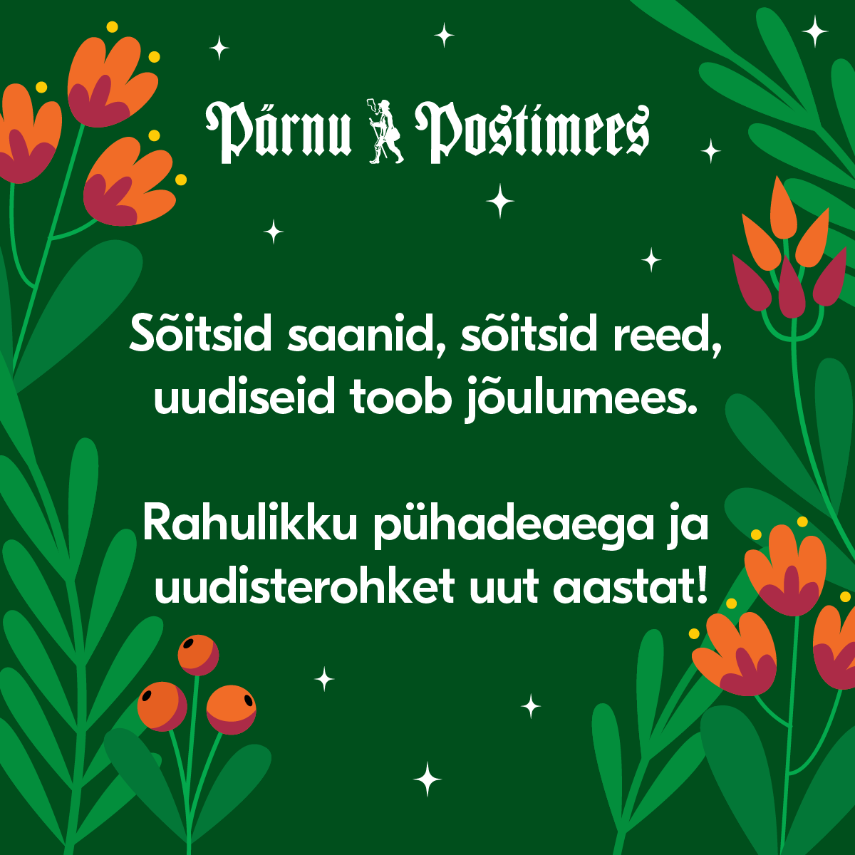
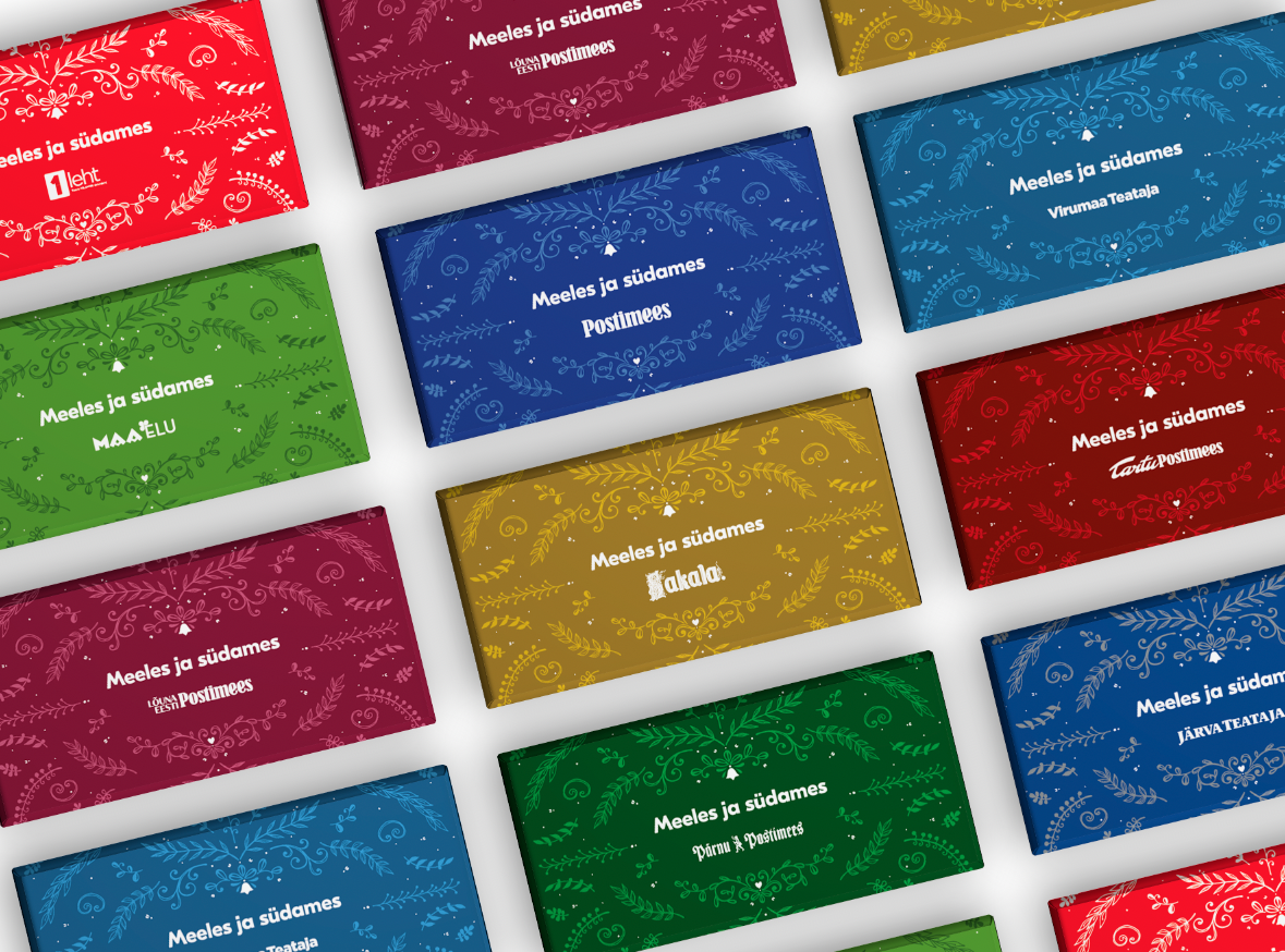
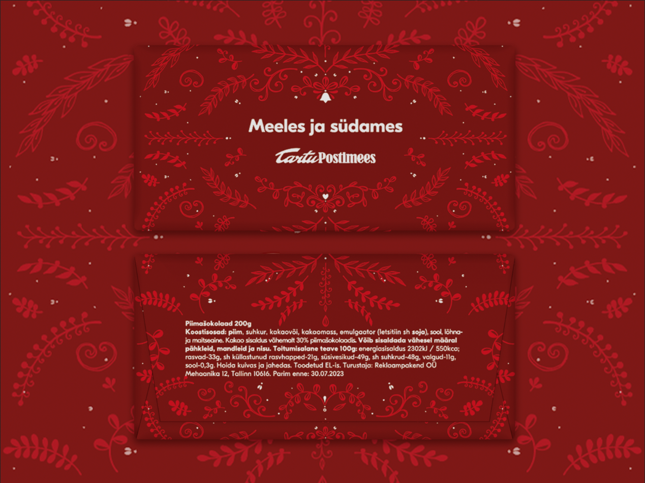
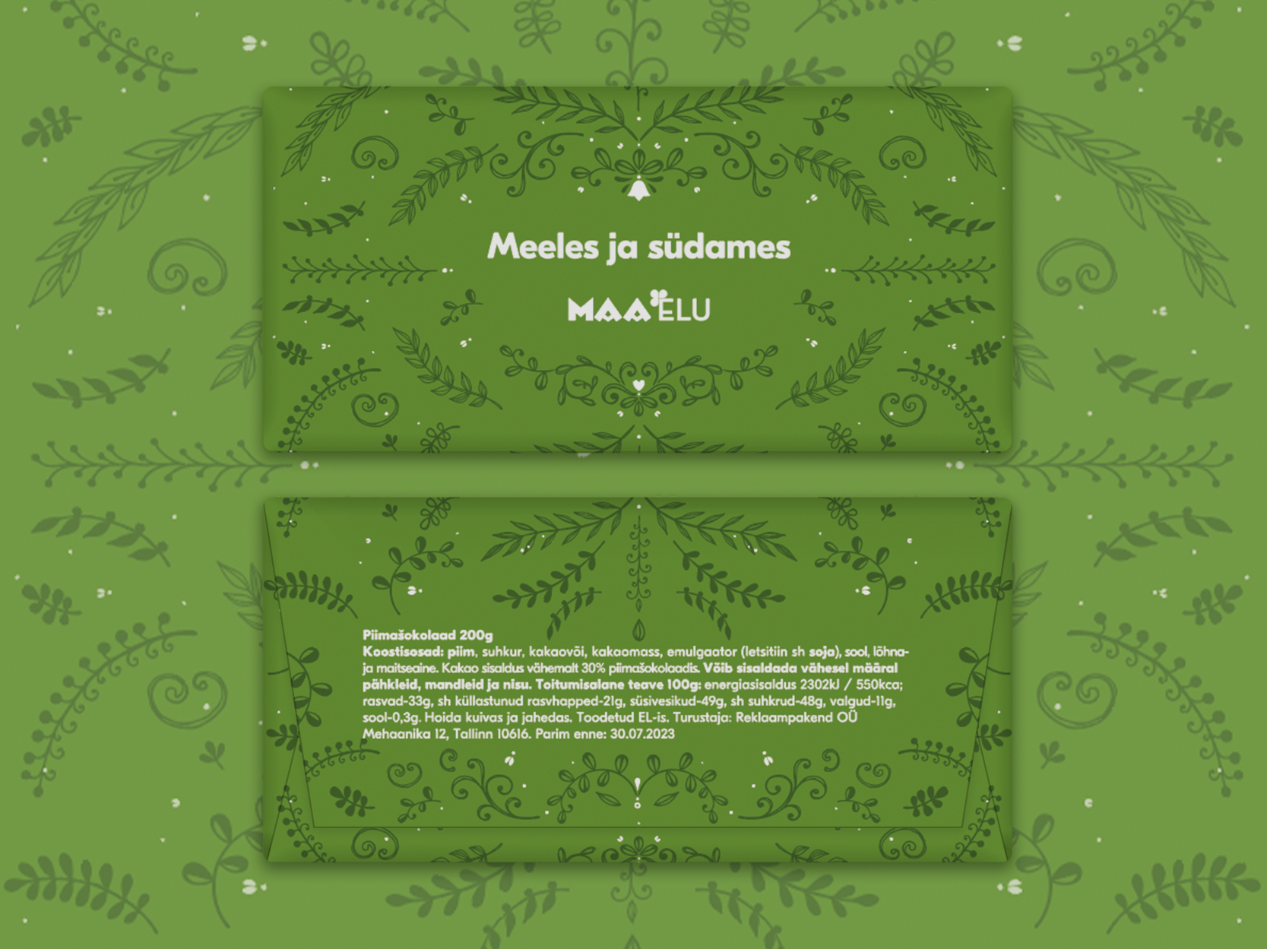
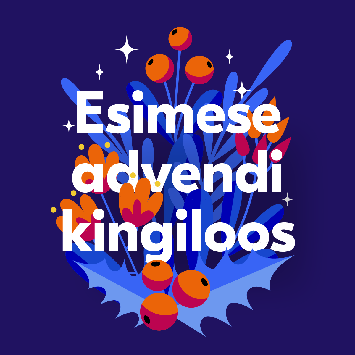
The group's annual Christmas mood campaign — seasonal greetings to subscribers, clients, and broadcast audiences. The work appeared across print, digital, and television, with each of Postimees Grupp's titles carrying its own CVI palette through one shared whimsical Christmas world. Custom chocolate packaging extended the same concept into a physical gift for clients.


Data Visualisation
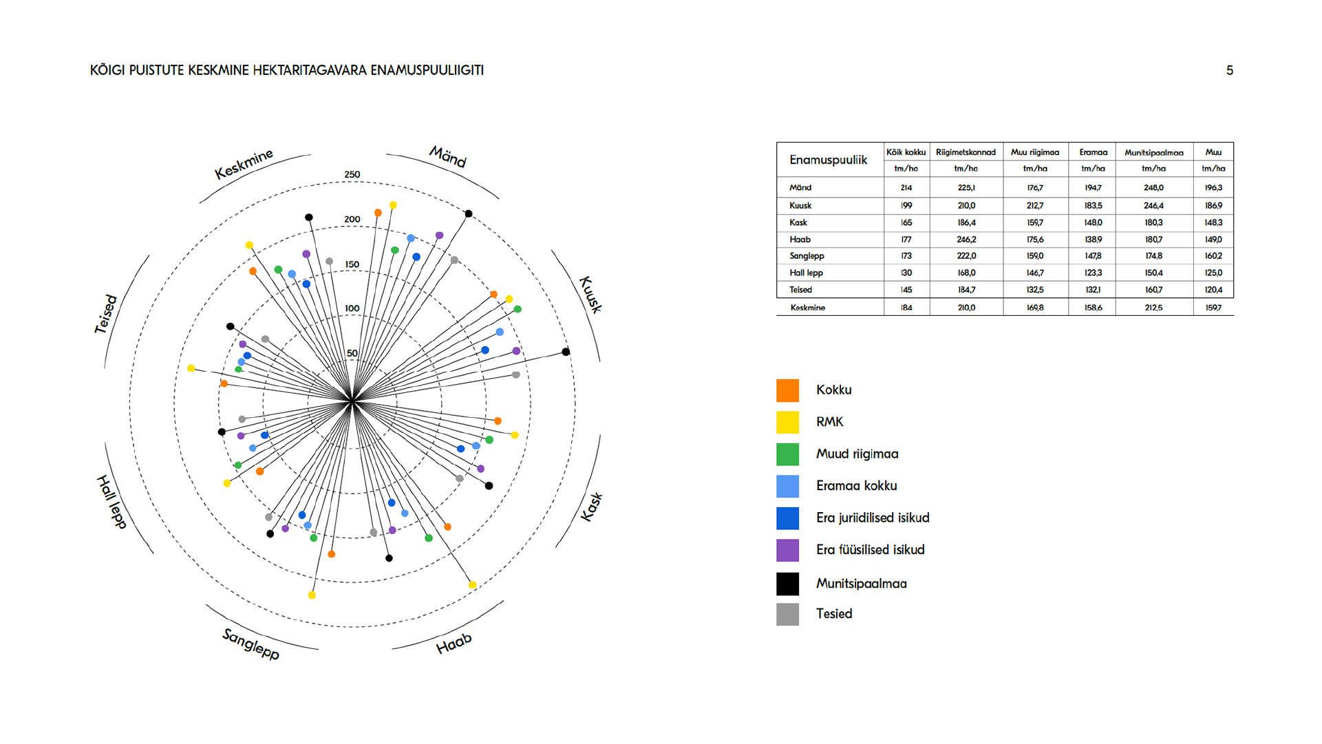
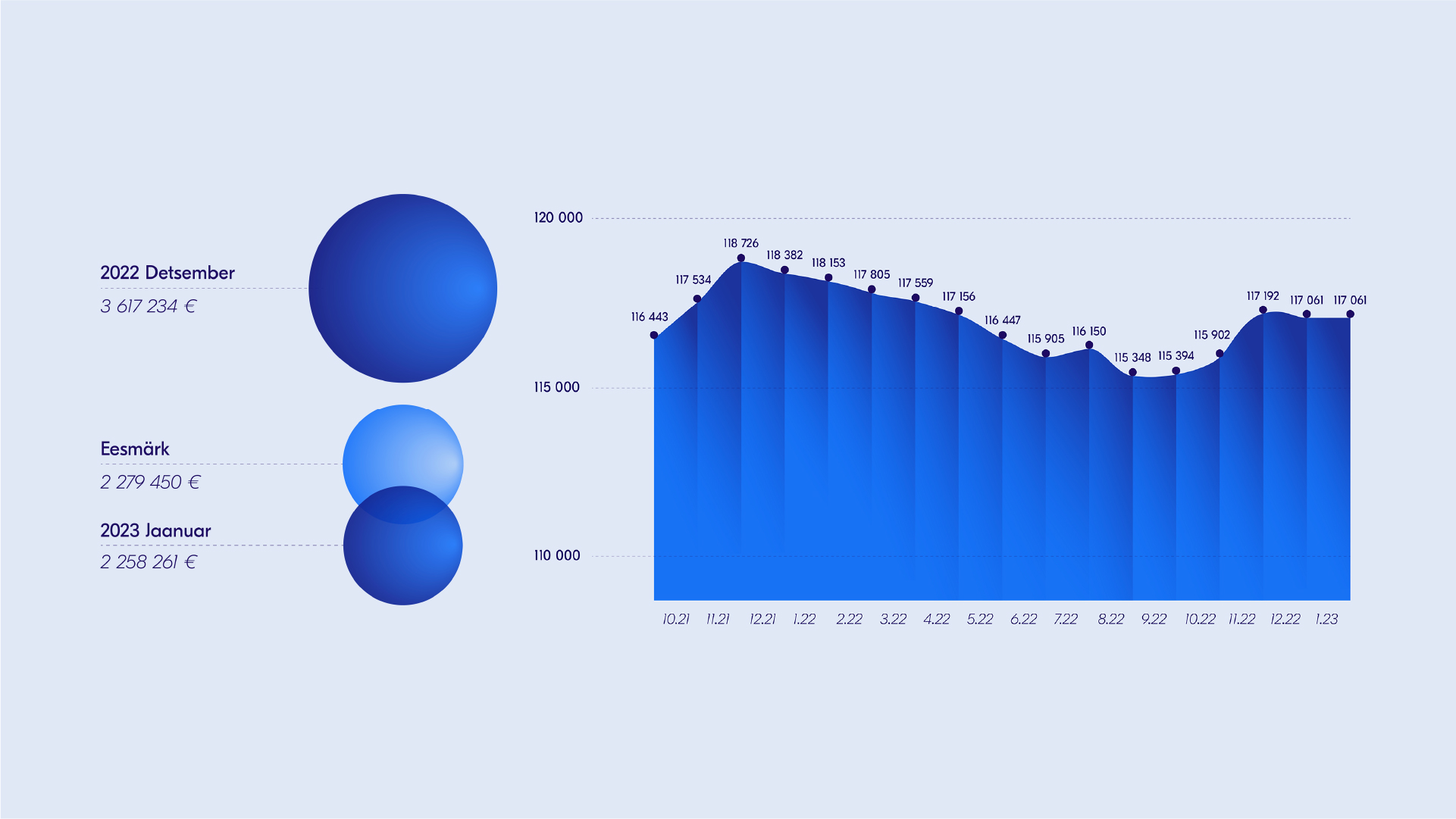
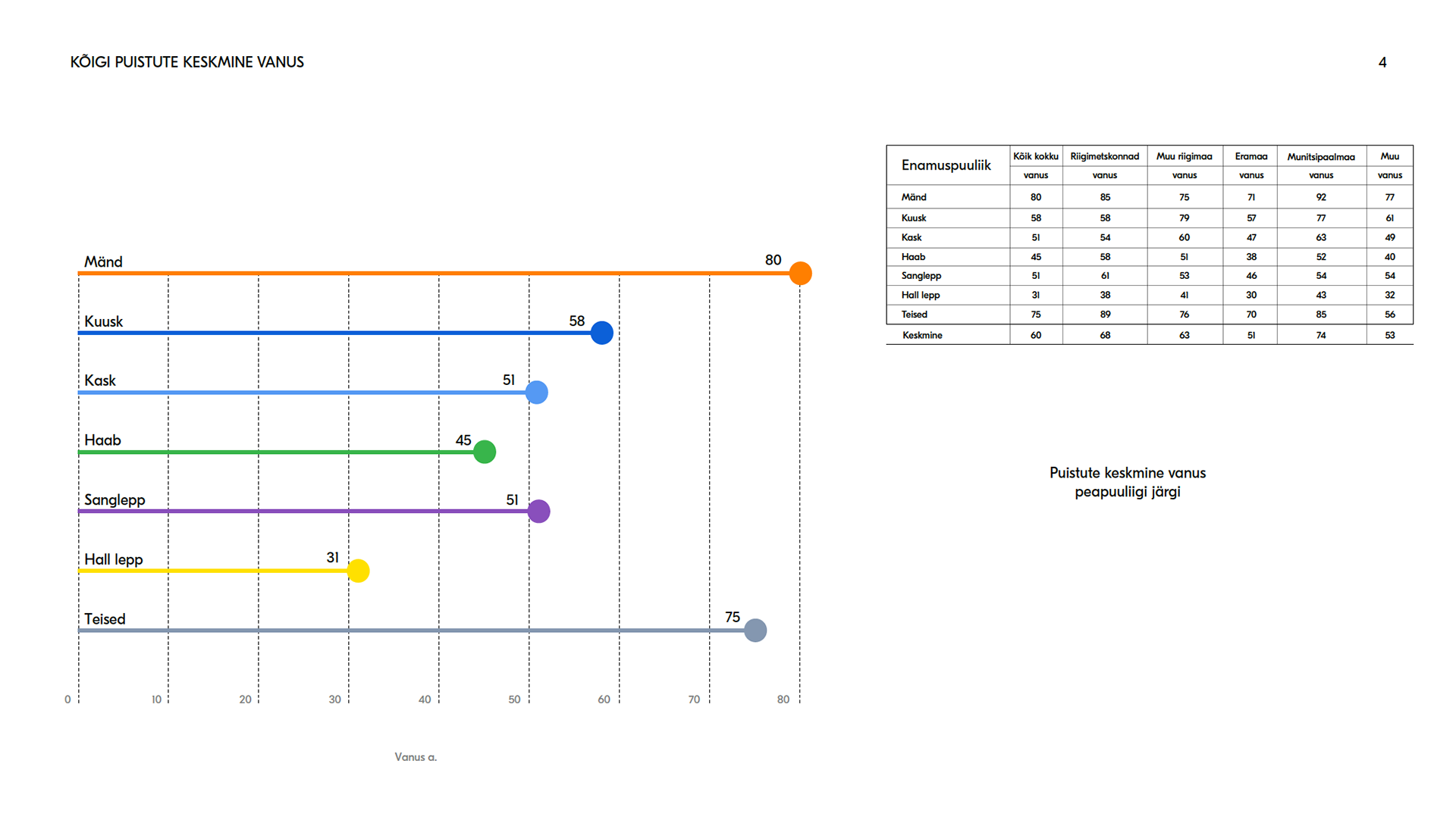
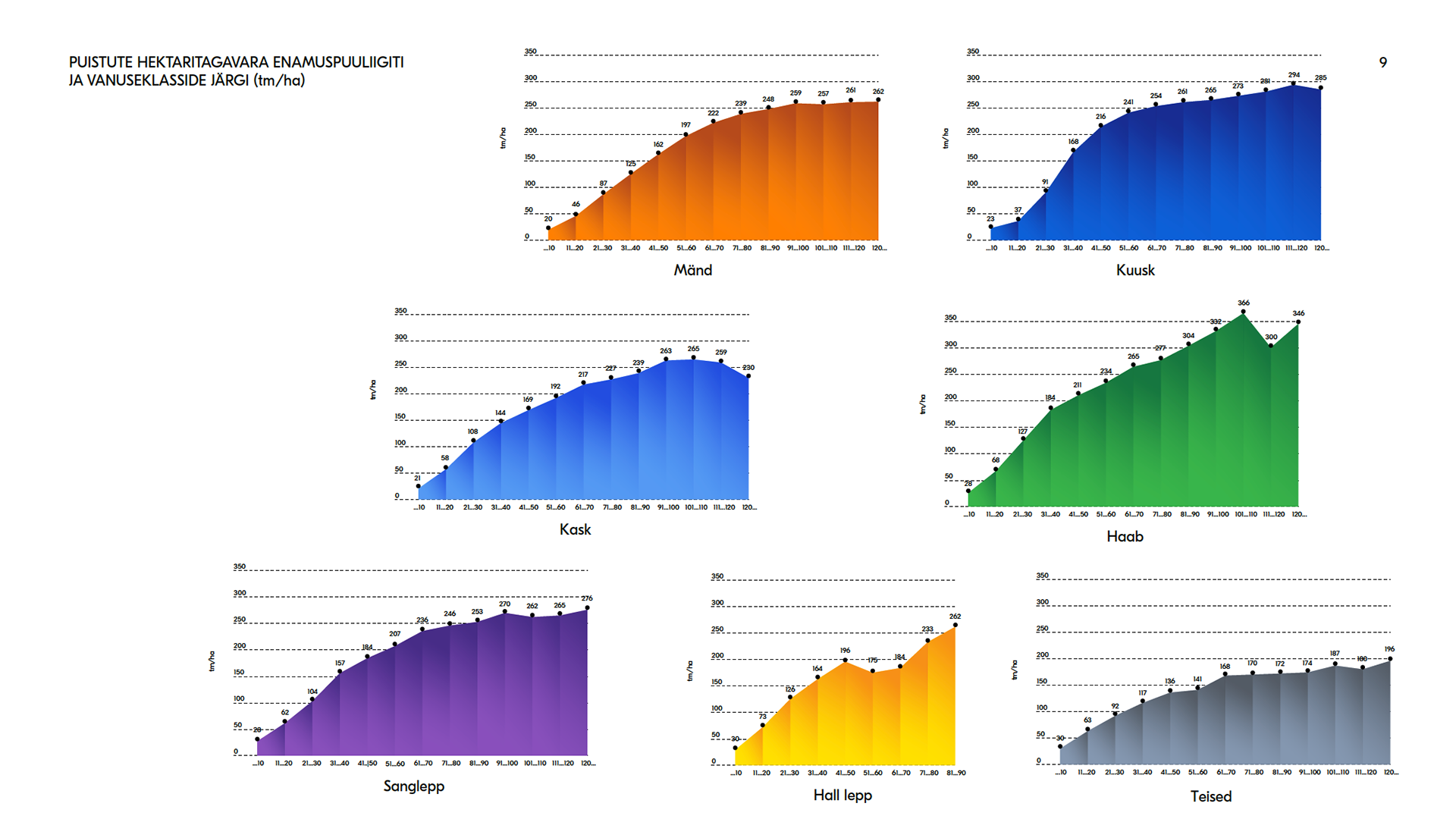
Data visualisation work spanning monthly internal company reports — with custom tables, charts, and editorial layouts — and a sustained collaboration with another designer on a published book of charts. The book is publicly available through the Estonian National Library.


UX/UI
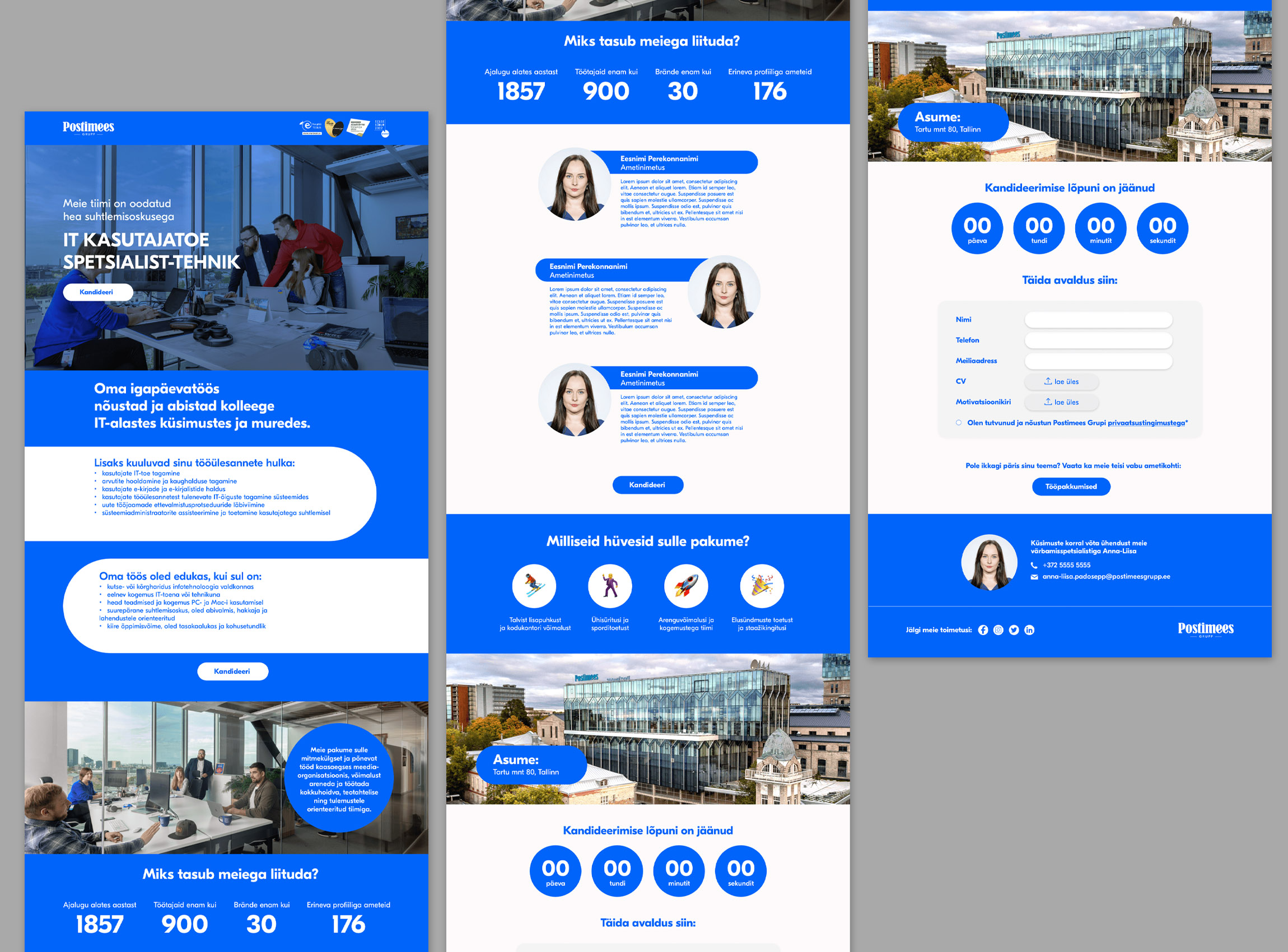
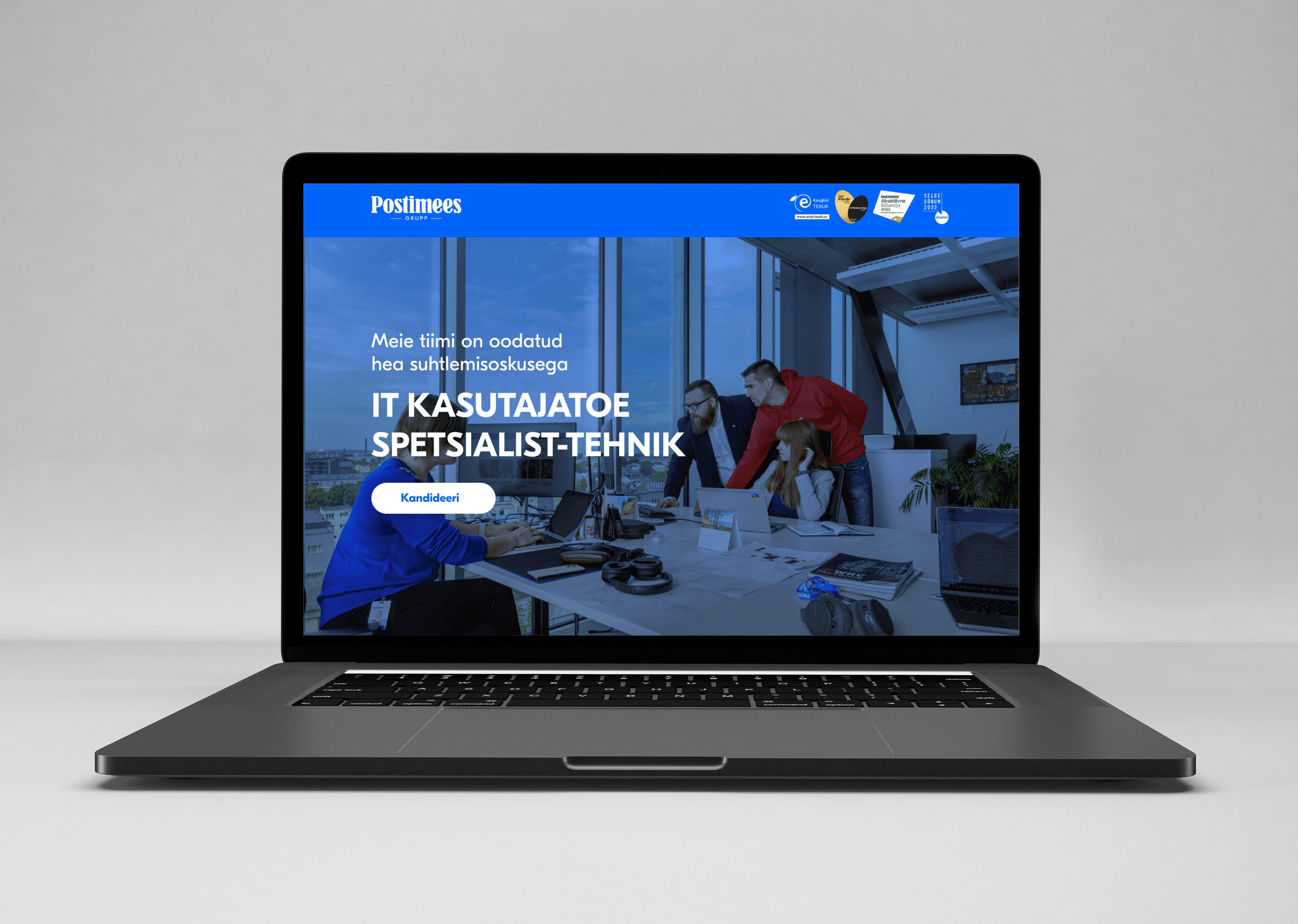
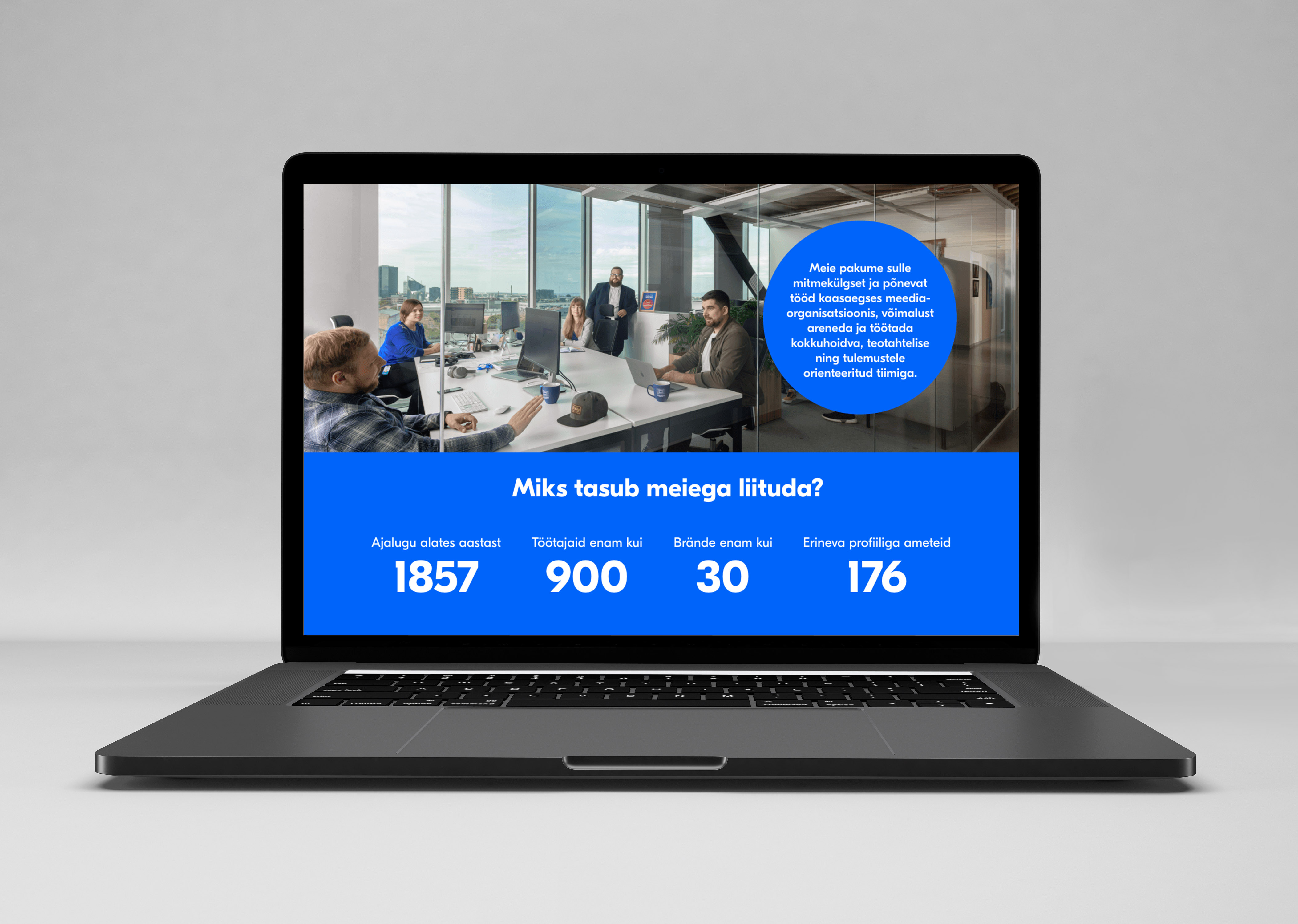
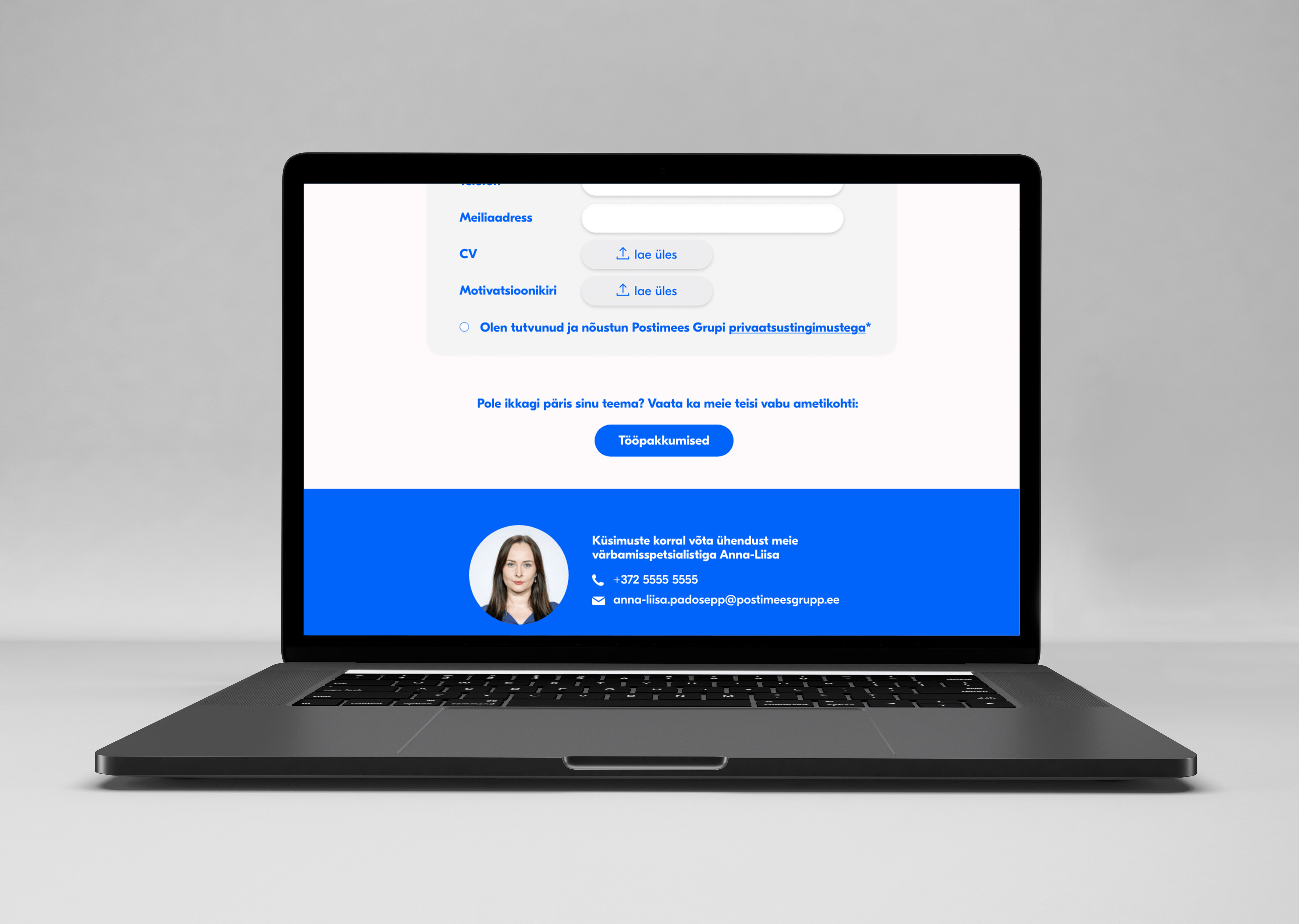
A redesign of the group's recruiting environment — covering layout, navigation, and visual system. The project involved both static design and UX/UI thinking around how candidates move through the application flow.


Event Marketing
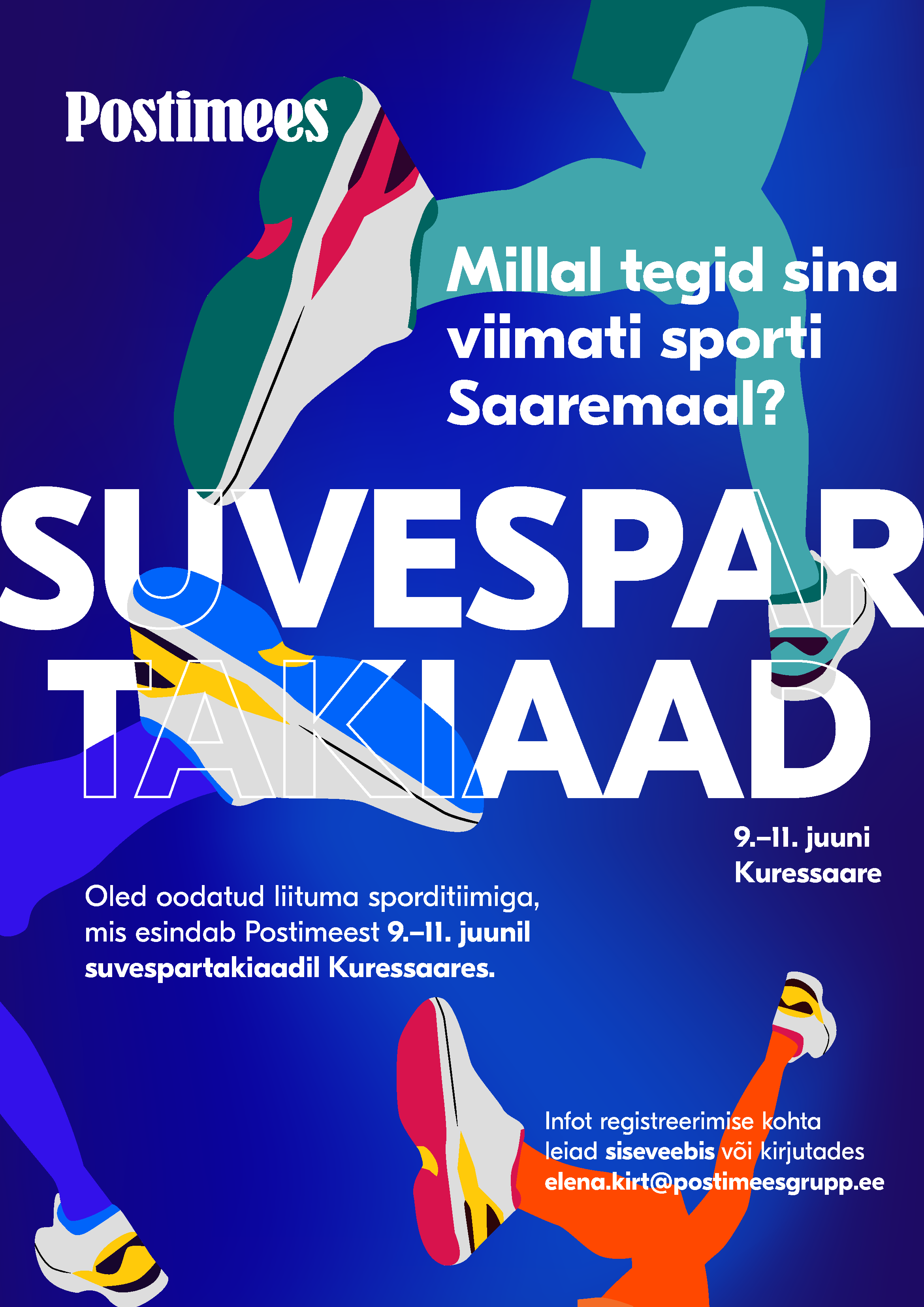
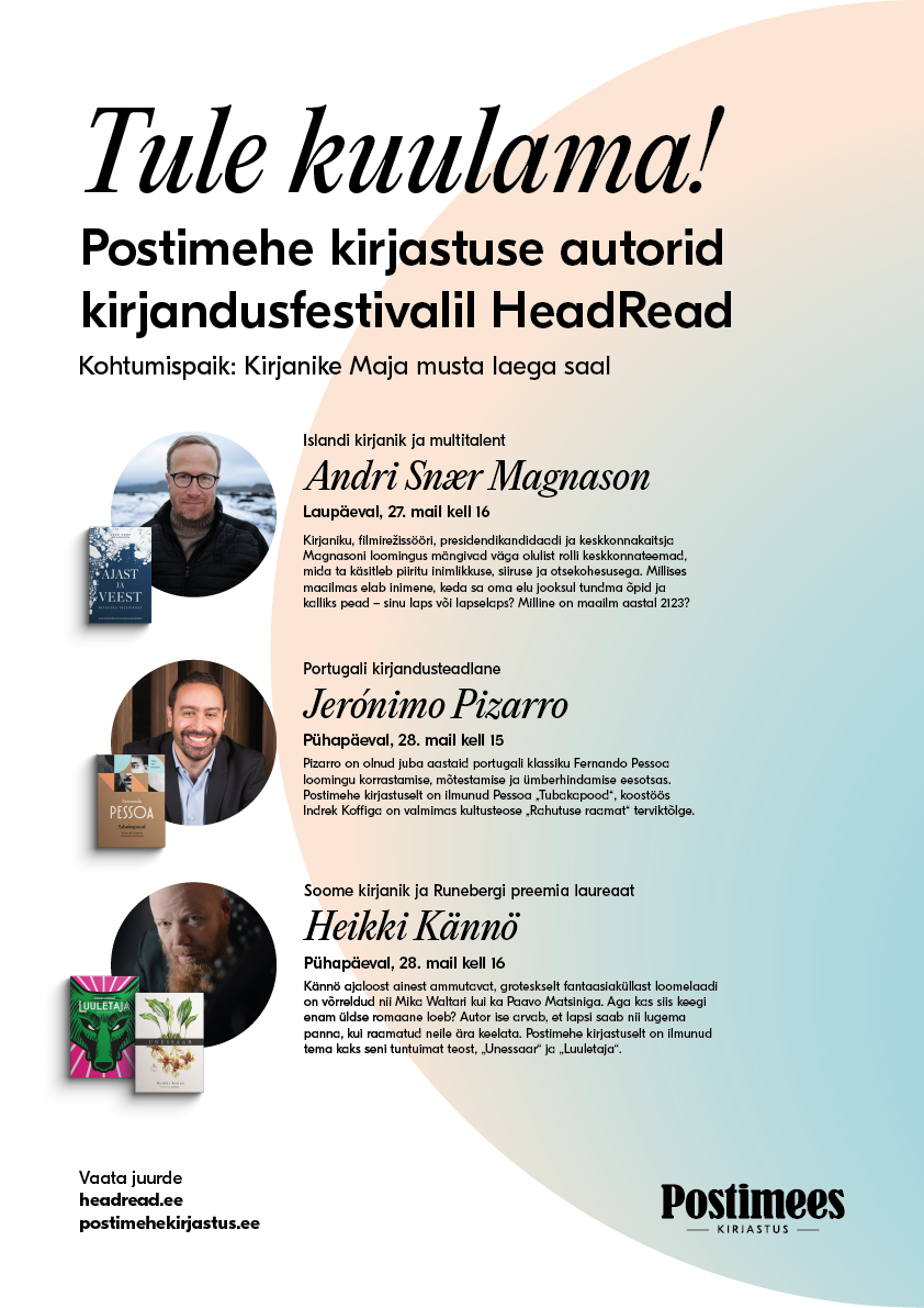
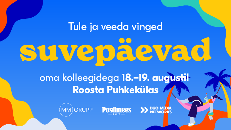
Visual identity, key visuals, and promotional materials for events organised by the group — covering both internal team programmes and public-facing campaigns. Each event needed its own recognizable look applied across print, digital, and on-site collateral.


Selected examples
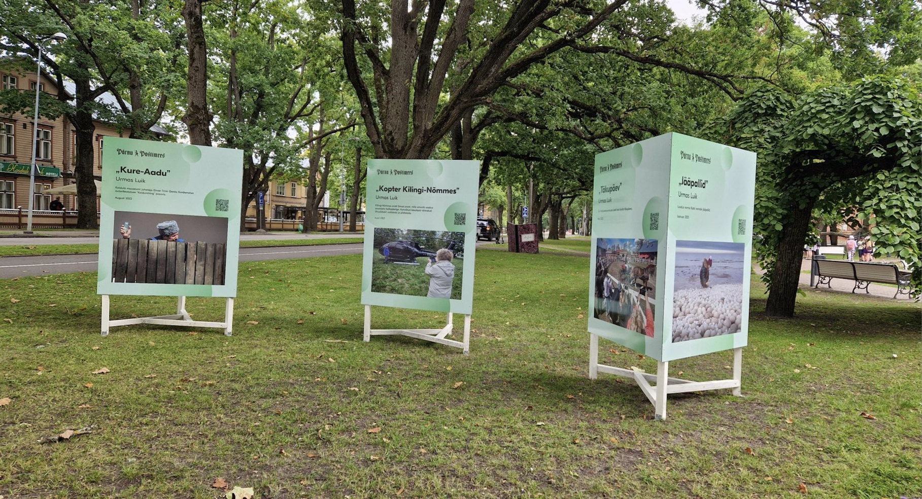
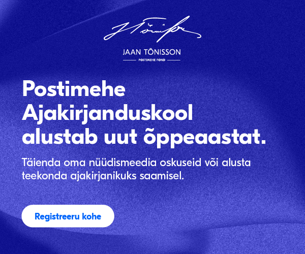
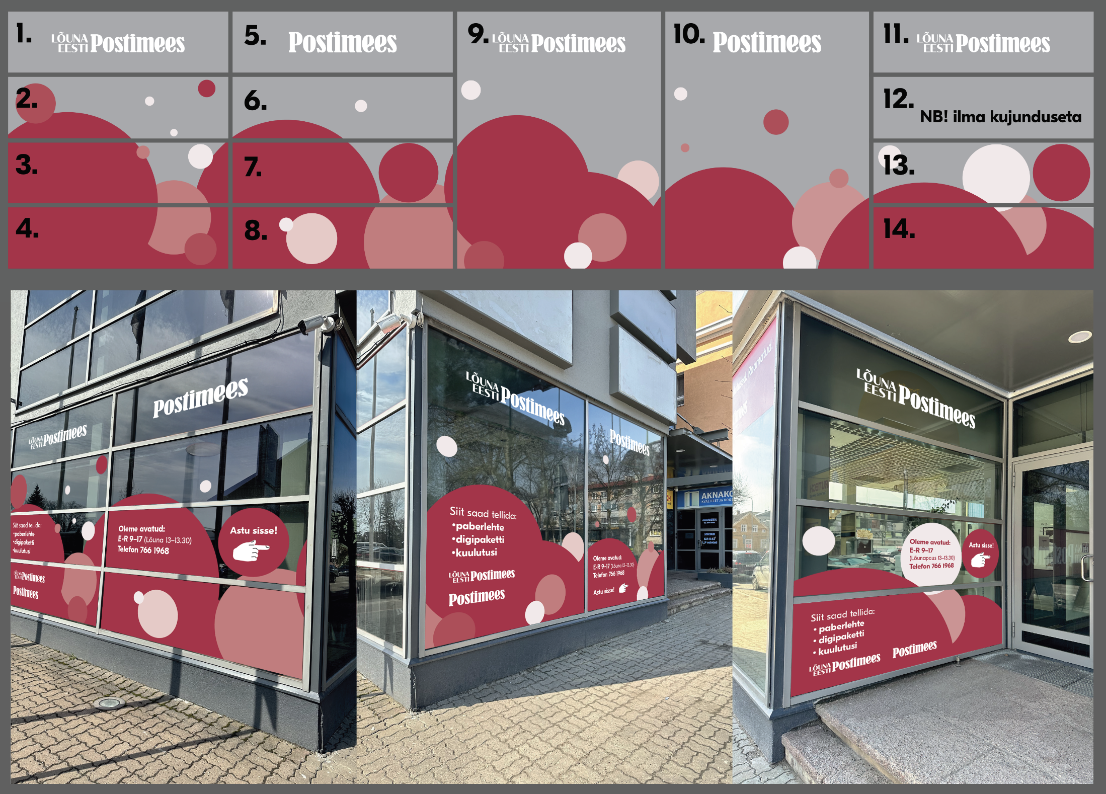
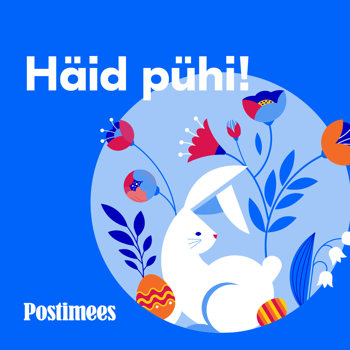
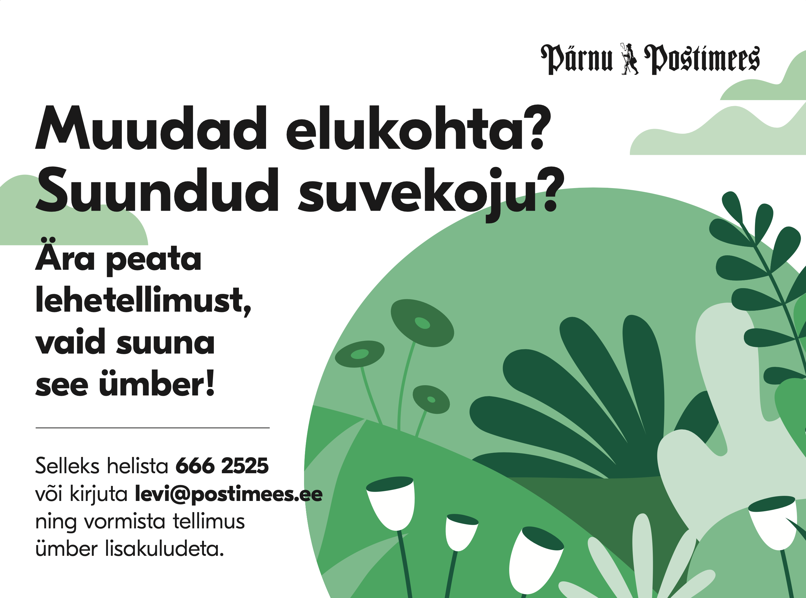
A wider selection of in-house work across Postimees Grupp. The role's ongoing responsibilities included adapting newspaper designs across the group's many print formats, producing campaigns and events for the book publishing arm, and turning around seasonal materials and branded merchandise — alongside larger one-off projects like the printed graphics covering the Lõuna Eesti Postimees office's glass facade.


Working at Postimees taught me to move quickly across formats — newspaper layouts, campaigns, branded merch, data visualisation, spatial graphics — inside the rhythm of a daily-news organisation. The range, from tightly-typeset reports to a facade-scale graphic on the Lõuna Eesti Postimees office, taught me that good design has to hold up regardless of scale or deadline.
Kontuur Leo Burnett
Junior Art Director
Junior Art Director at Kontuur Leo Burnett, a Tallinn-based creative agency. The role centred on packaging, brand identity, and integrated campaigns across food, beverage, retail, and consumer brands — with a steady mix of print, illustration, and motion work alongside senior creative leadership. Selected projects include the Premia ice cream facelift (Kuldmuna 2023 — 1st place, Package Design) and the Tanker Brewery beer label series (two finalists, Kuldmuna 2022).

Premia
Kuldmuna 2023 · 1st place, Package Design
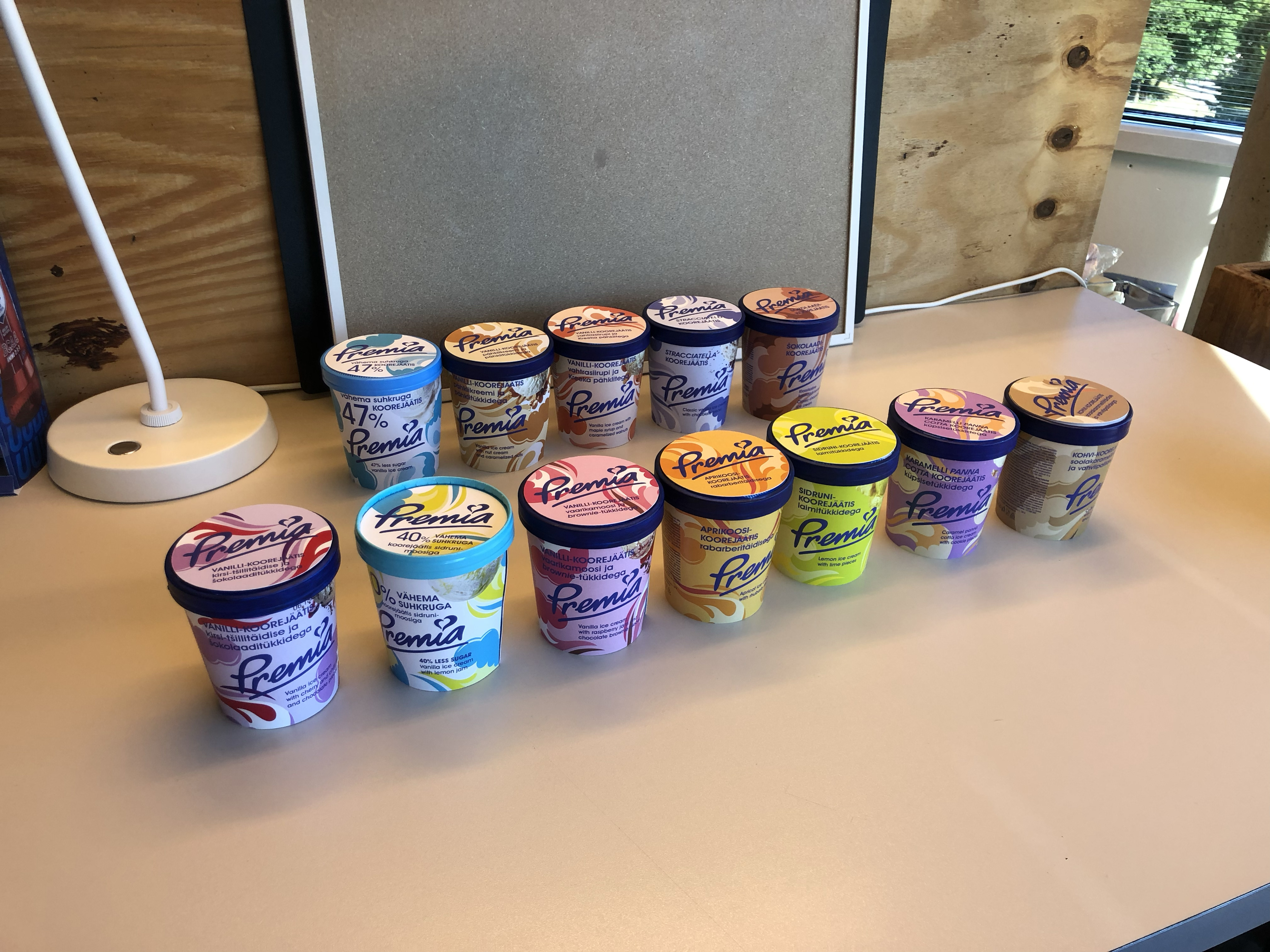
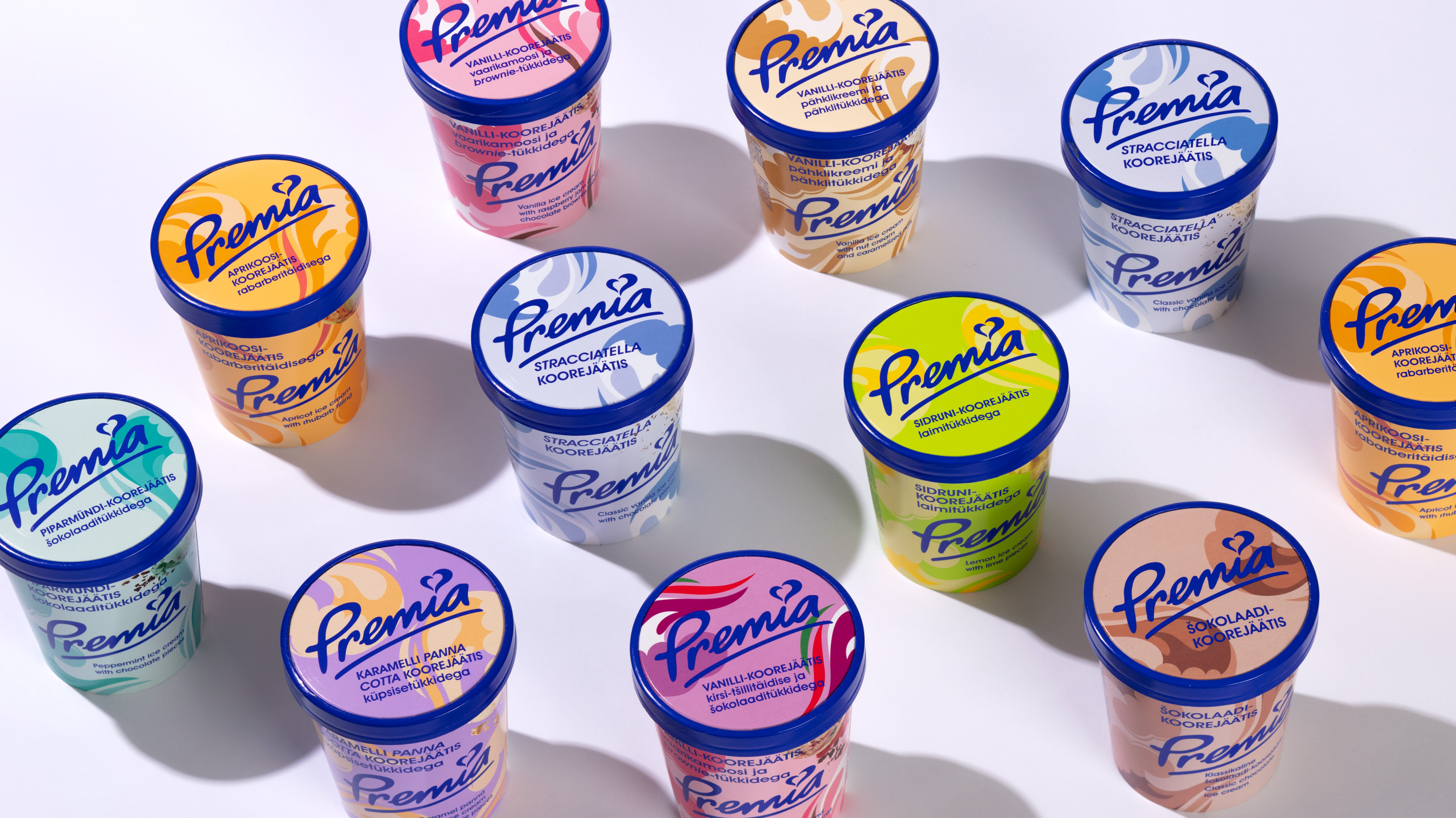
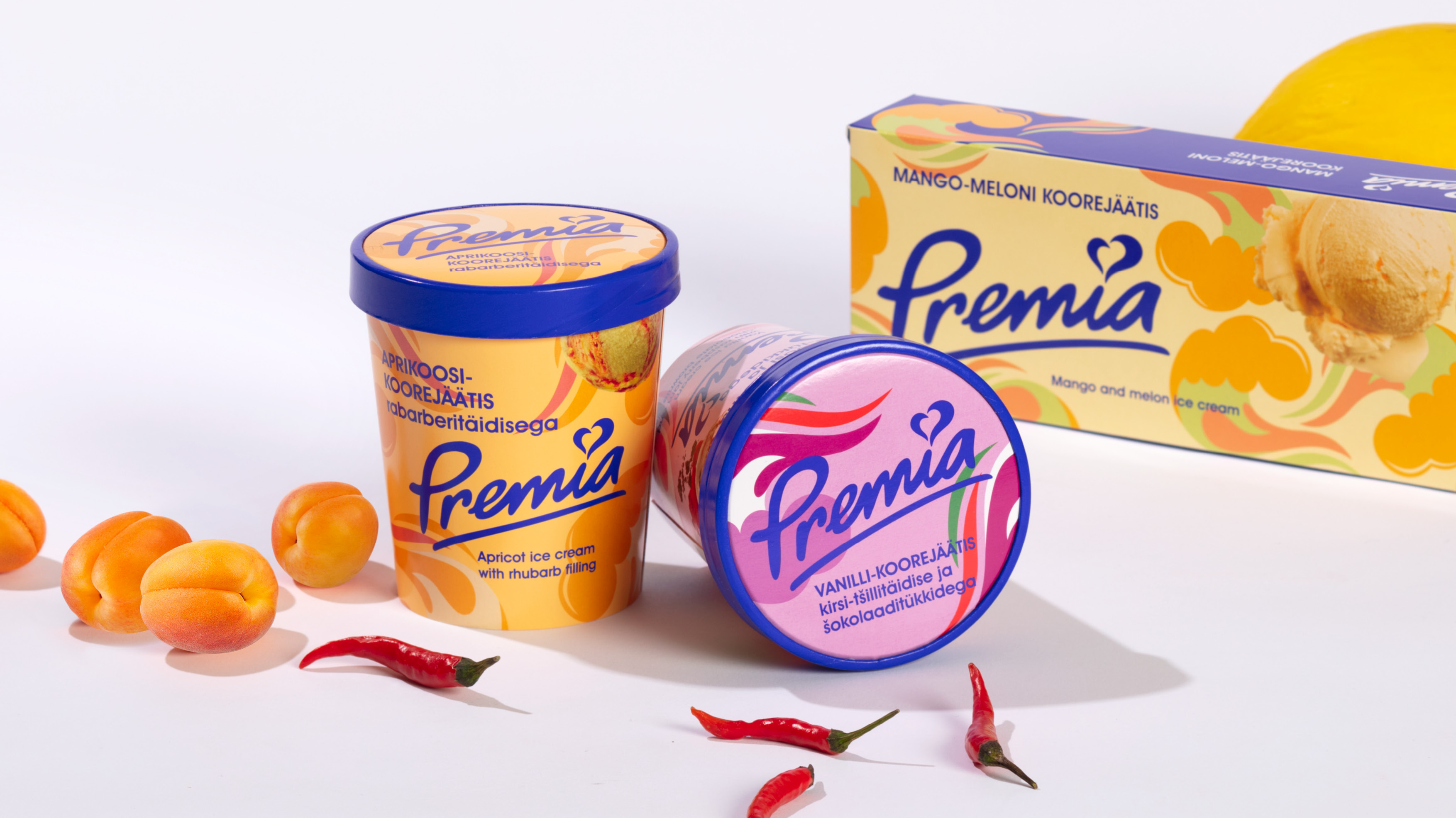
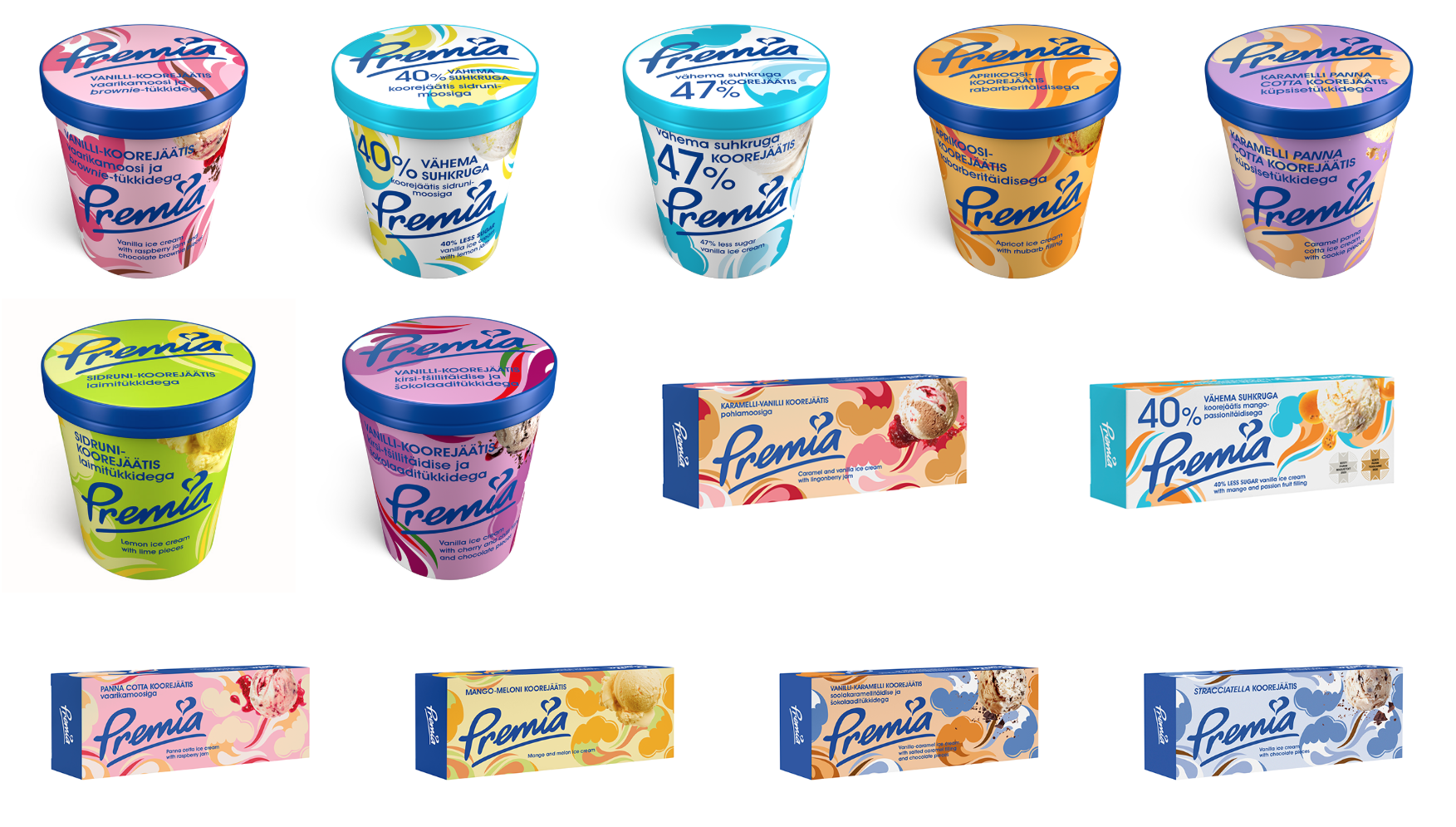
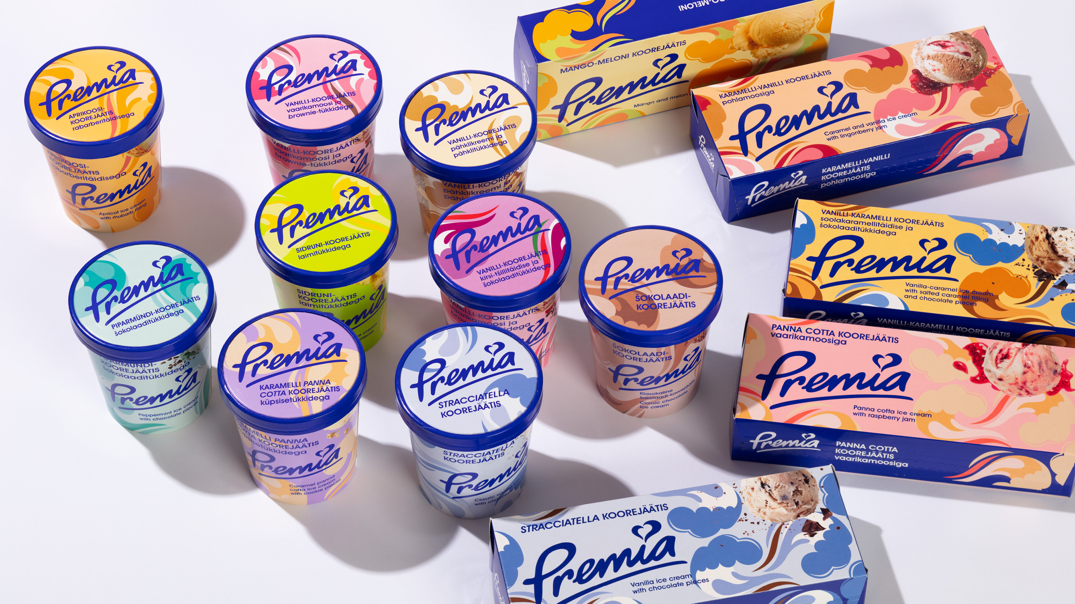
A complete packaging facelift for one of Estonia's most beloved ice cream brands. Developed at Kontuur Leo Burnett under a creative director and senior art director. My role as supporting art director focused on adapting the pattern's colour system across each flavour, designing every package in the range, and seeing the project through print production — from file preparation through to checking final test prints.The system spans every format Premia produces — family cartons, single-serve tubs, novelty shapes — keeping the brand instantly recognizable on the shelf while modernising its tone. The project won 1st place in the Package Design category at the Golden Egg 2023.

The challenge: refreshing Premia's packaging without alienating decades of brand recognition. The redesign keeps the warmth and product clarity Estonians associate with Premia, while tightening the typography, expanding the illustration system across flavours, and bringing more energy to the shelf presence. The system spans every format Premia produces — family cartons, single-serve tubs, novelty shapes — so the brand reads consistently from kiosk freezer to supermarket aisle.
Developed at Kontuur Leo Burnett, this was a massive undertaking led by a creative director and a senior art director who originated the pattern system. My role was supporting art director — orchestrating the colour palette of the pattern for each flavour, designing every package in the range, and handling print production from file preparation through to checking final test prints. The system went on to win 1st place in Package Design at the Golden Egg 2023.
Tanker Brewery
TWO FINALISTS · KULDMUNA 2022
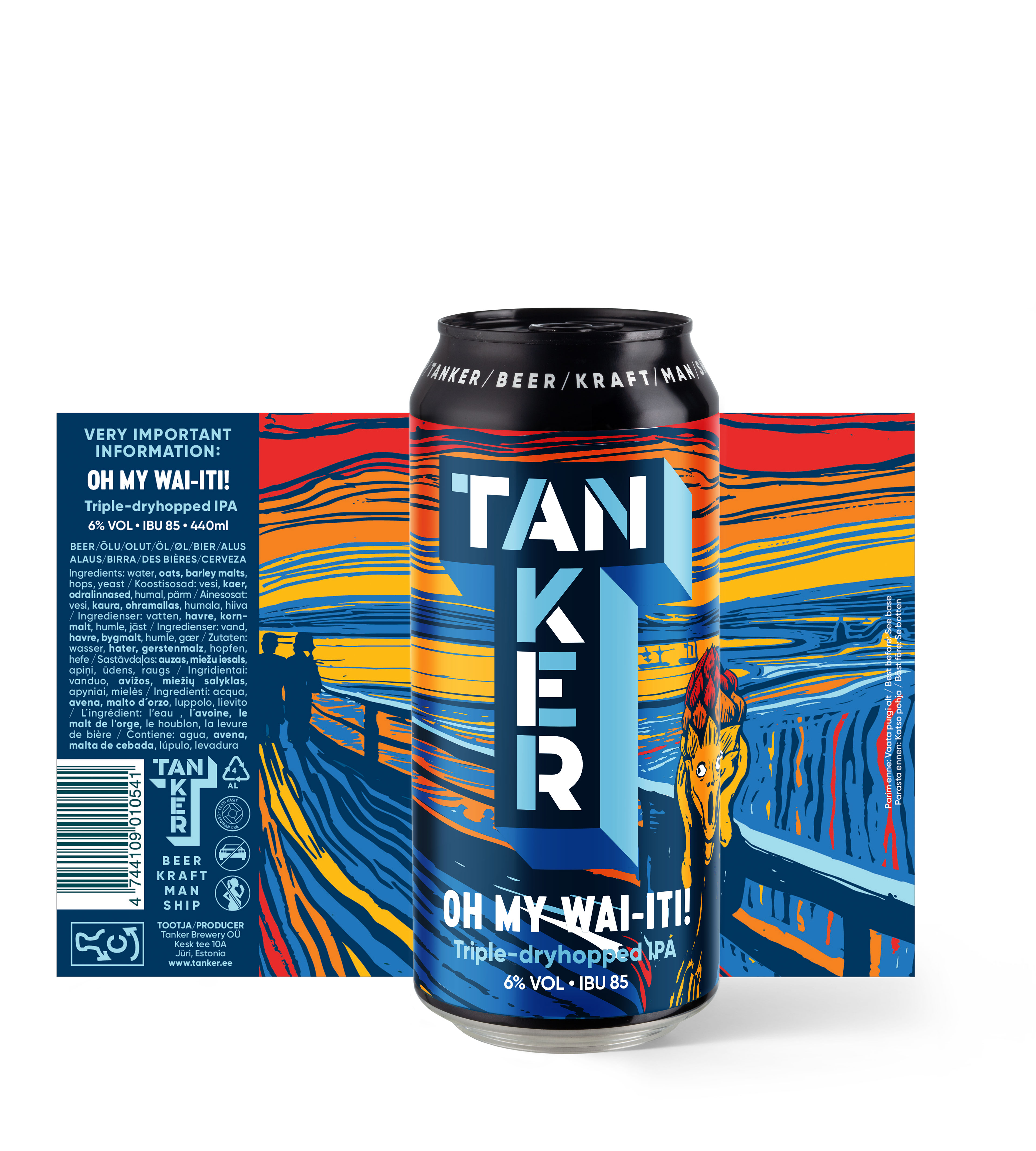
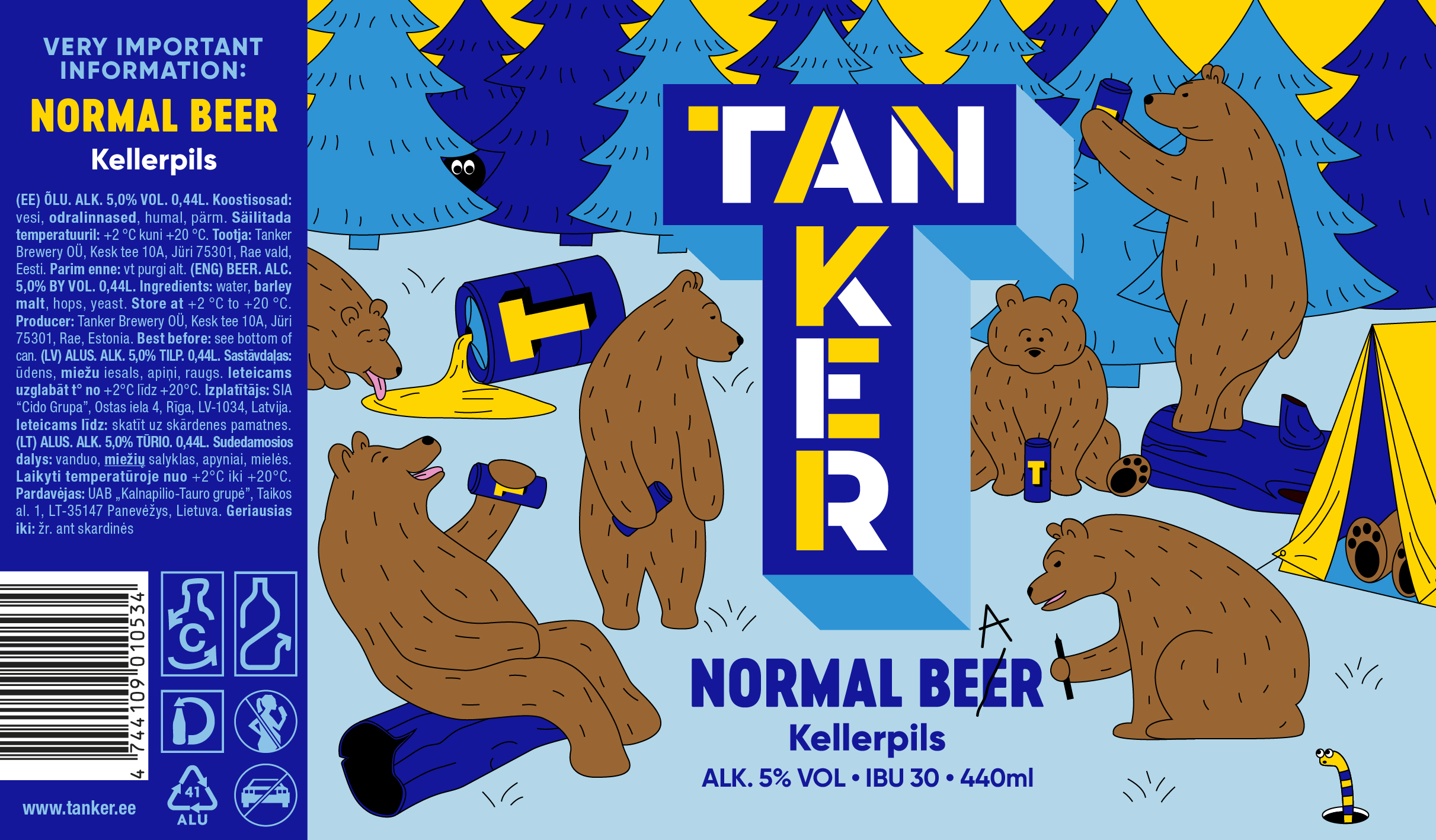
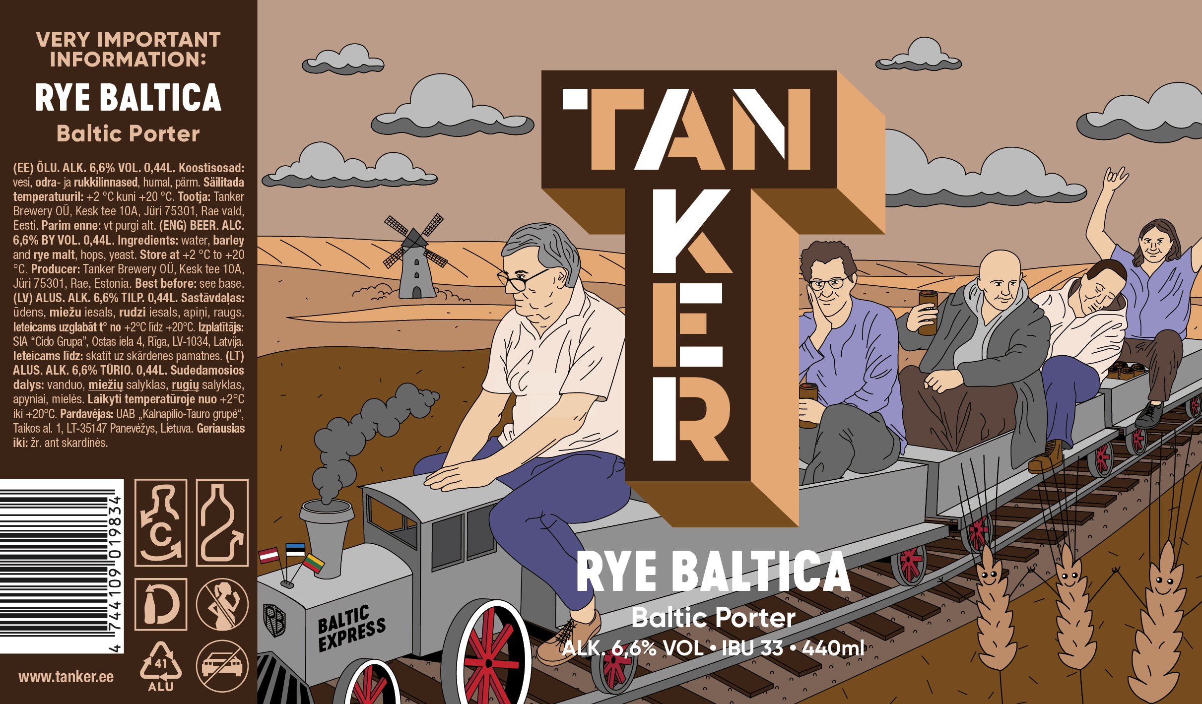
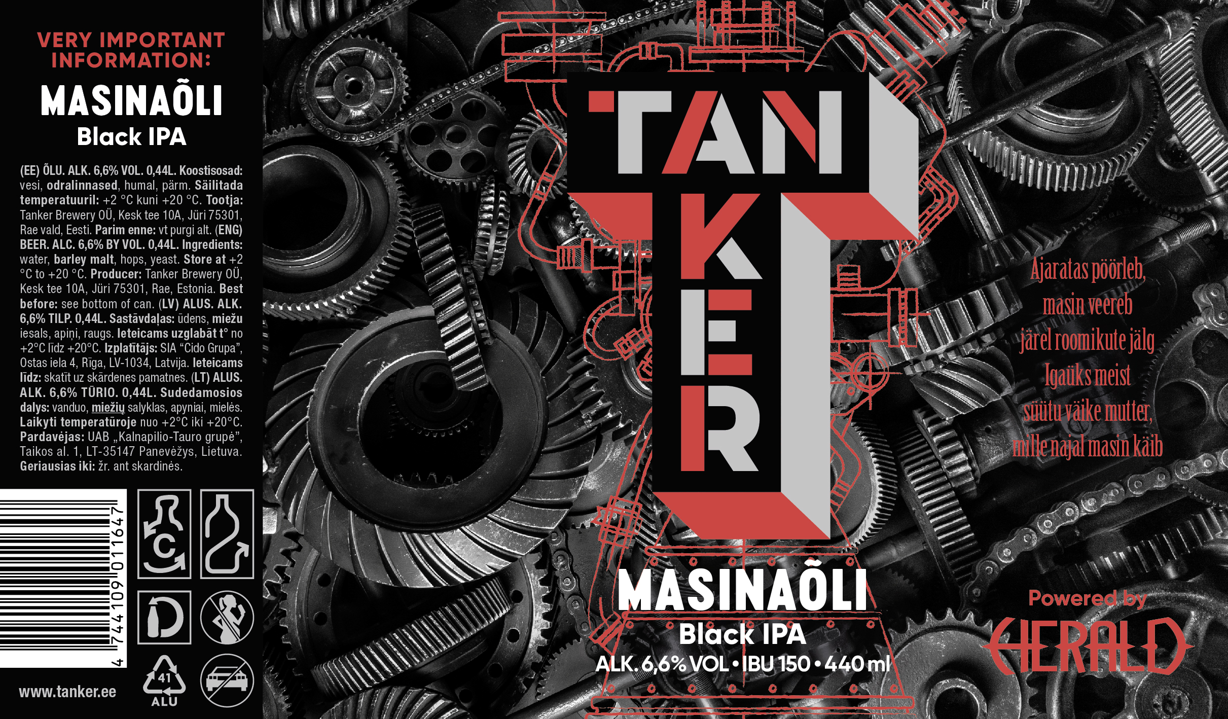
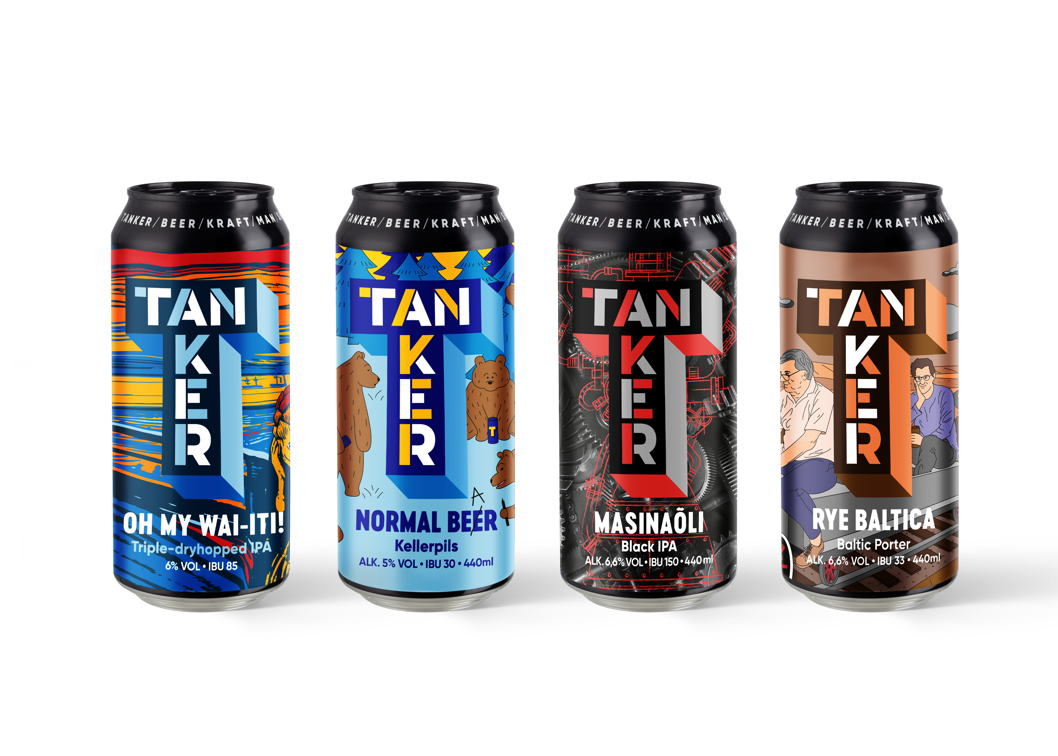
A series of four illustrated beer labels for Tanker Brewery, one of Estonia's most distinctive craft producers. I led the project as art director and illustrator under a supervising creative director at Kontuur Leo Burnett — developing the visual character of each can by combining bold typography with custom illustration that reflects the personality and story of the beer inside. Two of the four labels were nominated as finalists at Kuldmuna 2022 in the Package Design: alcoholic drinks category.

A keller pils — clean, light, easy-drinking. The illustration places Tanker's mascot bears in a stylized Estonian forest at sunset: drinking, lounging, pitching tents. Loose linework and high-contrast blues and yellows keep the scene playful while staying readable on the shelf.
Finalist · Kuldmuna 2022

A Baltic porter brewed with rye. The illustration centres on a steam train rolling through farmland — old-world industrial weight rendered with warm, illustrative texture. Browns, dusty reds, and muted blues echo the beer's malt-forward, deeply roasted profile.
Finalist · Kuldmuna 2022

A black IPA brewed in a long-running collaboration with Estonian heavy metal band Herald, named after their album Masin (Machine). The label leans on photographic composition rather than illustration — machinery, gears, and industrial textures nodding toward both the band's sound and the beer's punishing 7.5% ABV.

A triple-dry-hopped IPA, part of Tanker's Oh My series. The label takes an existing illustration referencing Munch's Scream and recolours it in warm reds, oranges, and yellows — retuning the artwork to communicate the beer's punchy, hop-forward character.

Gardest
2020 — 2022
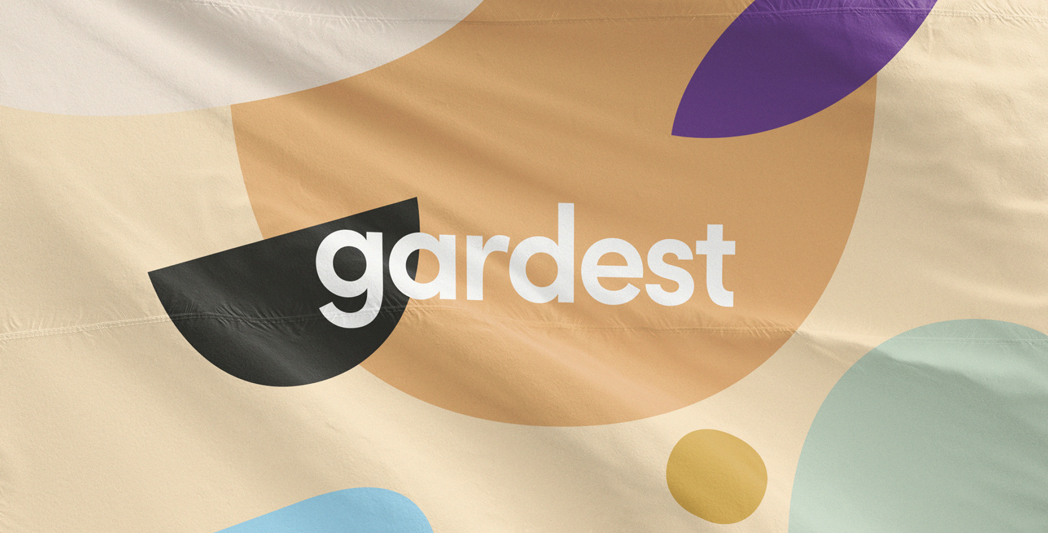
Long-running art direction and illustration for Gardest, the Baltics' largest garden and home centre. Across two years at Kontuur Leo Burnett, I owned the brand's day-to-day creative output — from spring planting and summer garden furniture through autumn home updates and Christmas — translated into hundreds of pieces across social, web, print, in-store materials, animated web banners, and outdoor work across the Tartu store.
The challenge was holding a consistent visual voice across all those touchpoints while keeping each campaign feeling fresh and season-specific. The brand's purple-and-green palette, organic illustration system, and warm tone became second nature — and let me move quickly between weekly campaign briefs without losing the brand's identity.

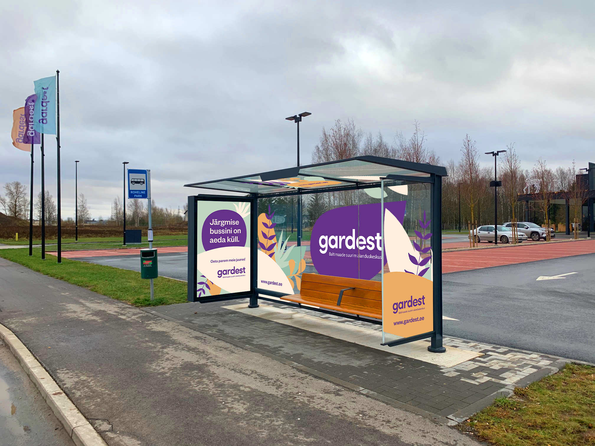
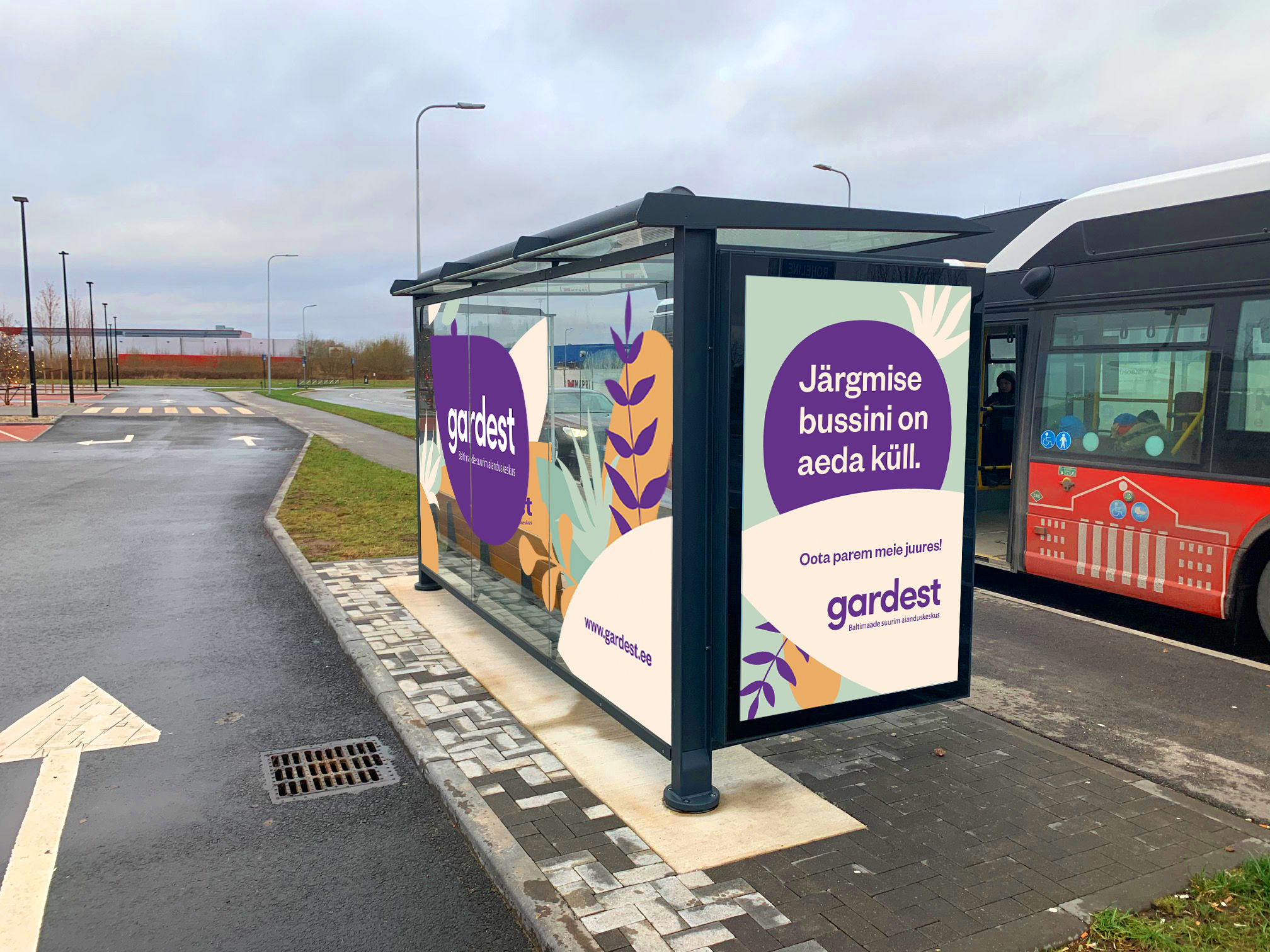
A custom bus stop pavilion design fronting the Gardest storefront — the kind of physical, persistent presence that turns a transit moment into a brand encounter. The artwork used the same illustration system carried through the rest of the season's campaigns, scaled to architectural format.


A constant rotation of animated banners across the Gardest website and digital ad placements — seasonal moods, product launches, and weekly campaign pushes. Each animation reused the illustration system as motion elements, keeping production fast and the brand voice consistent.
Ericius
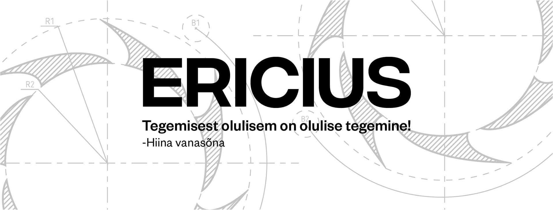
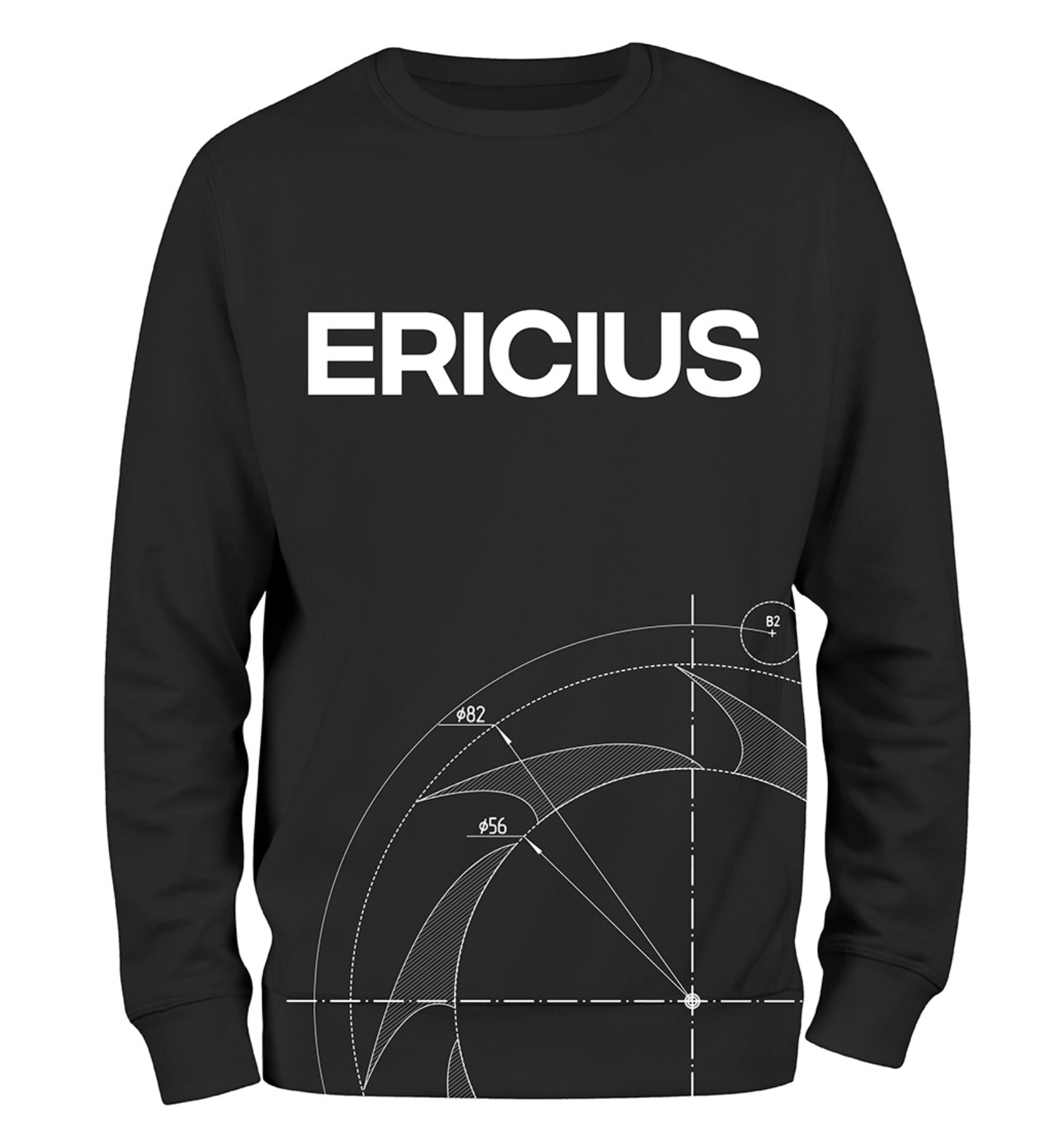
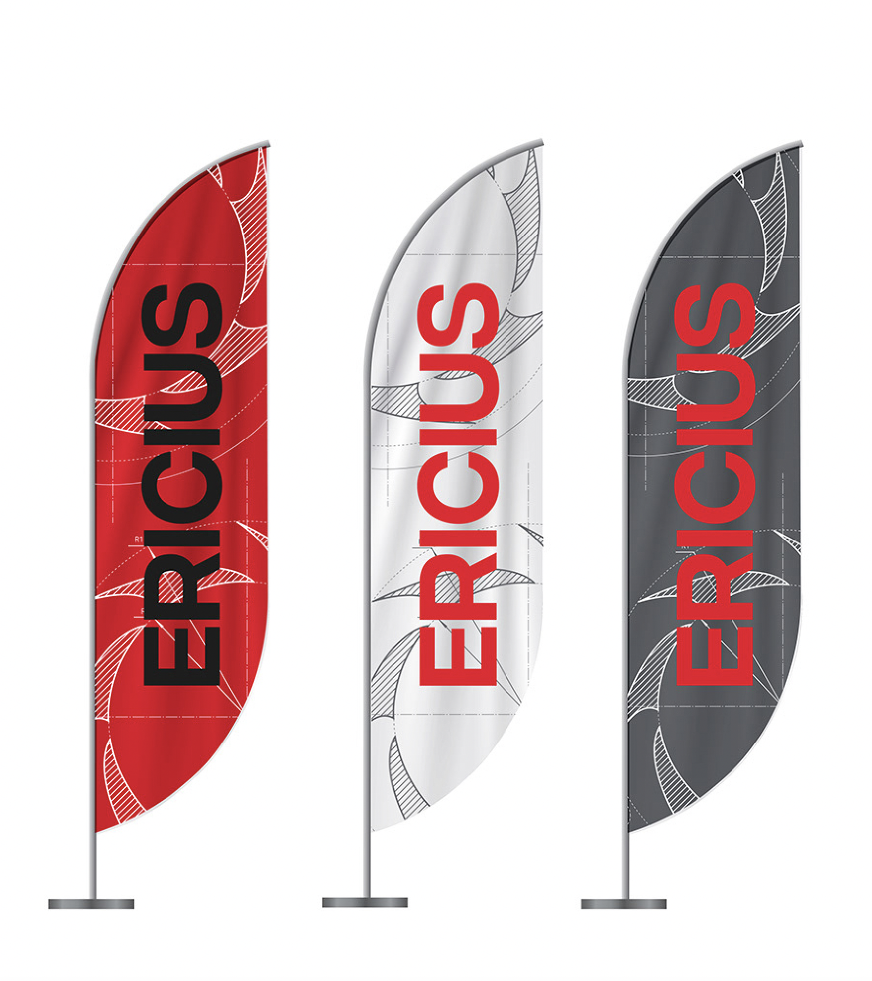
CVI remake for Ericius — the student society of TalTech Tartu College's Faculty of Construction Sciences. New logo, type system, and merch identity, rolled out across event posters, social, and apparel.

Rakvere
TV commercial for Rakvere, one of Estonia's largest meat brands. I worked across the spot as art director, animator, food stylist — and, in close-up, a hand model.
Estonian Food Industry
Animated TV commercial for the Estonian Food Industry Association's "Südamega tehtud" campaign. I designed the illustrated characters and supplied the illustration system for the spot.
Two years at Kontuur sharpened my range across packaging, brand identity, illustration, and campaign work. The Kuldmuna win for Premia and the Tanker finalists the year before are the visible markers — but what I really carry forward is the daily craft of working inside a full creative team: alongside creative directors, copywriters, senior art directors, and clients with real expectations.